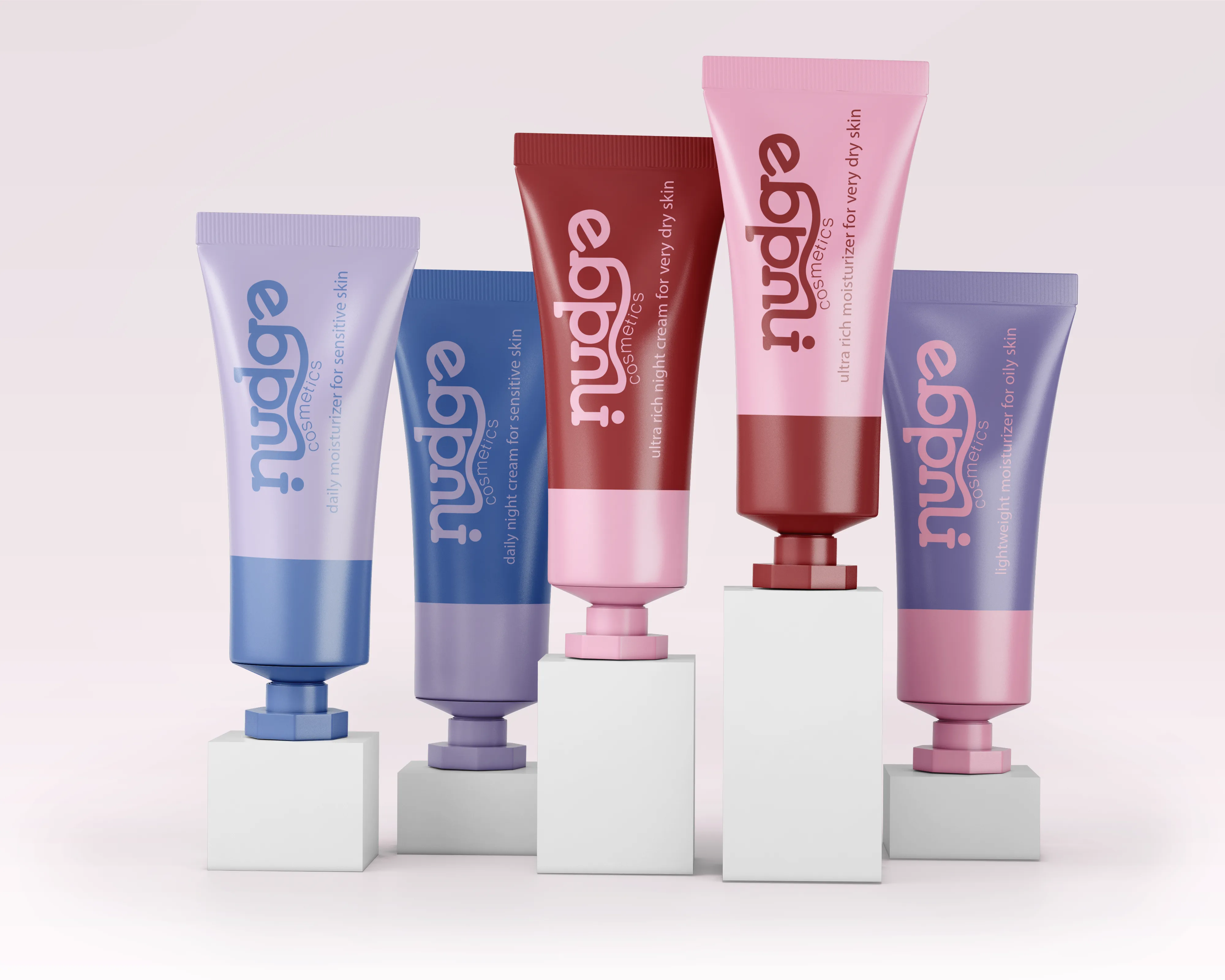
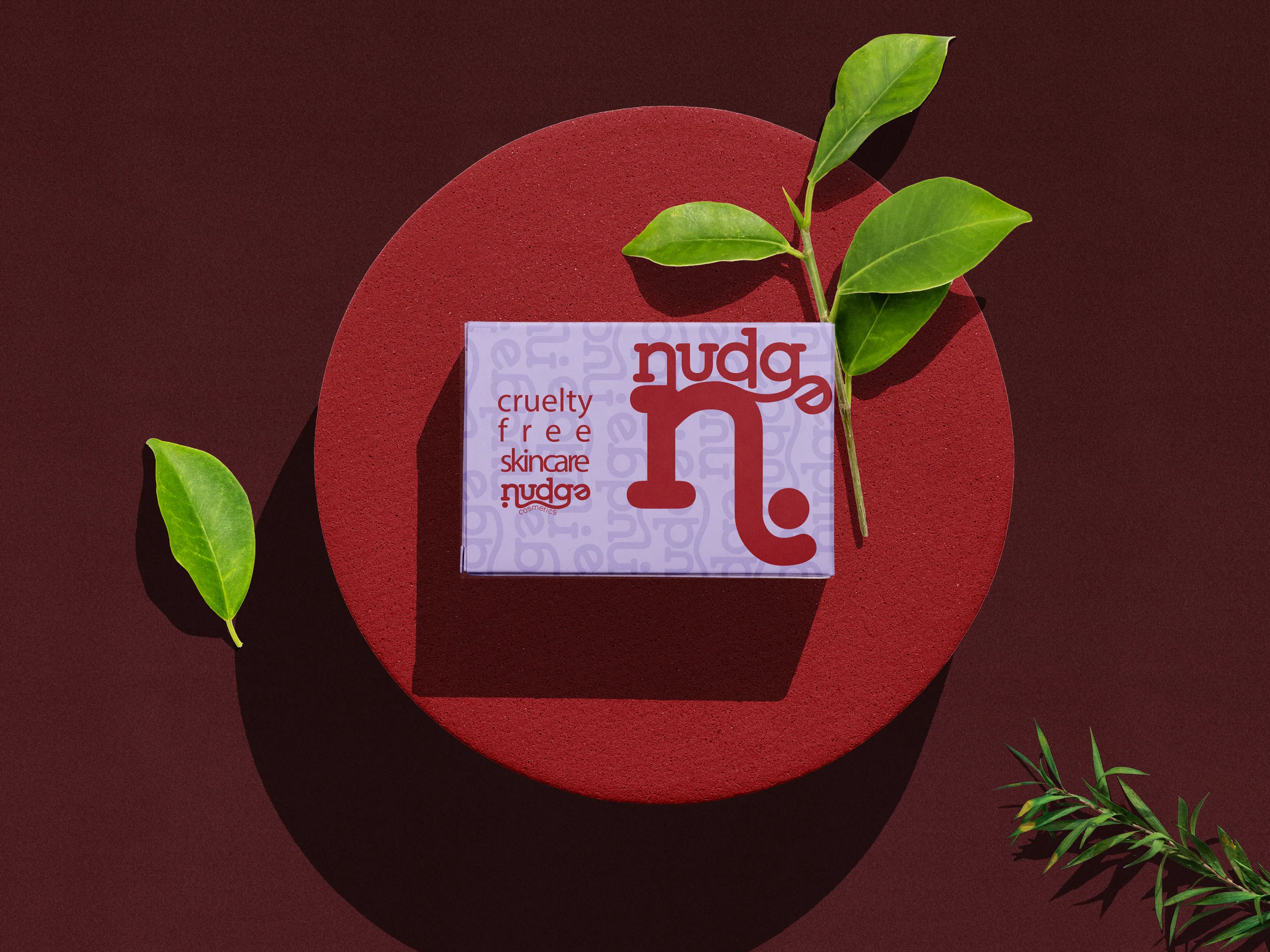
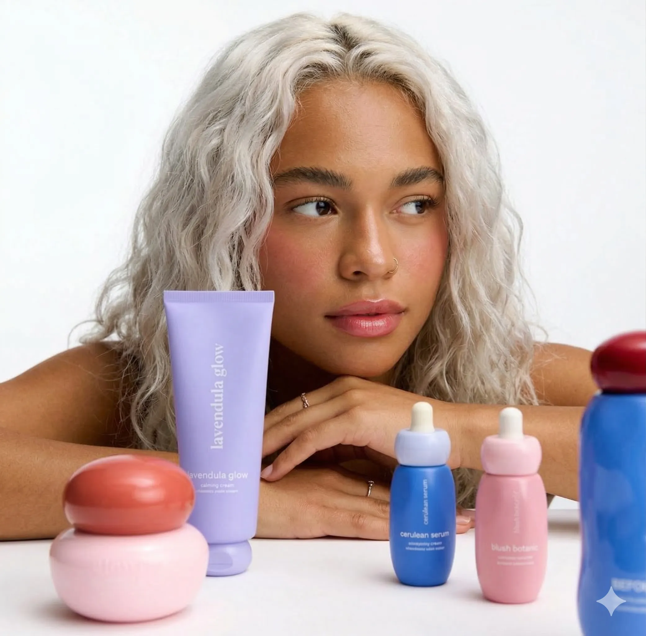
Case Study 01
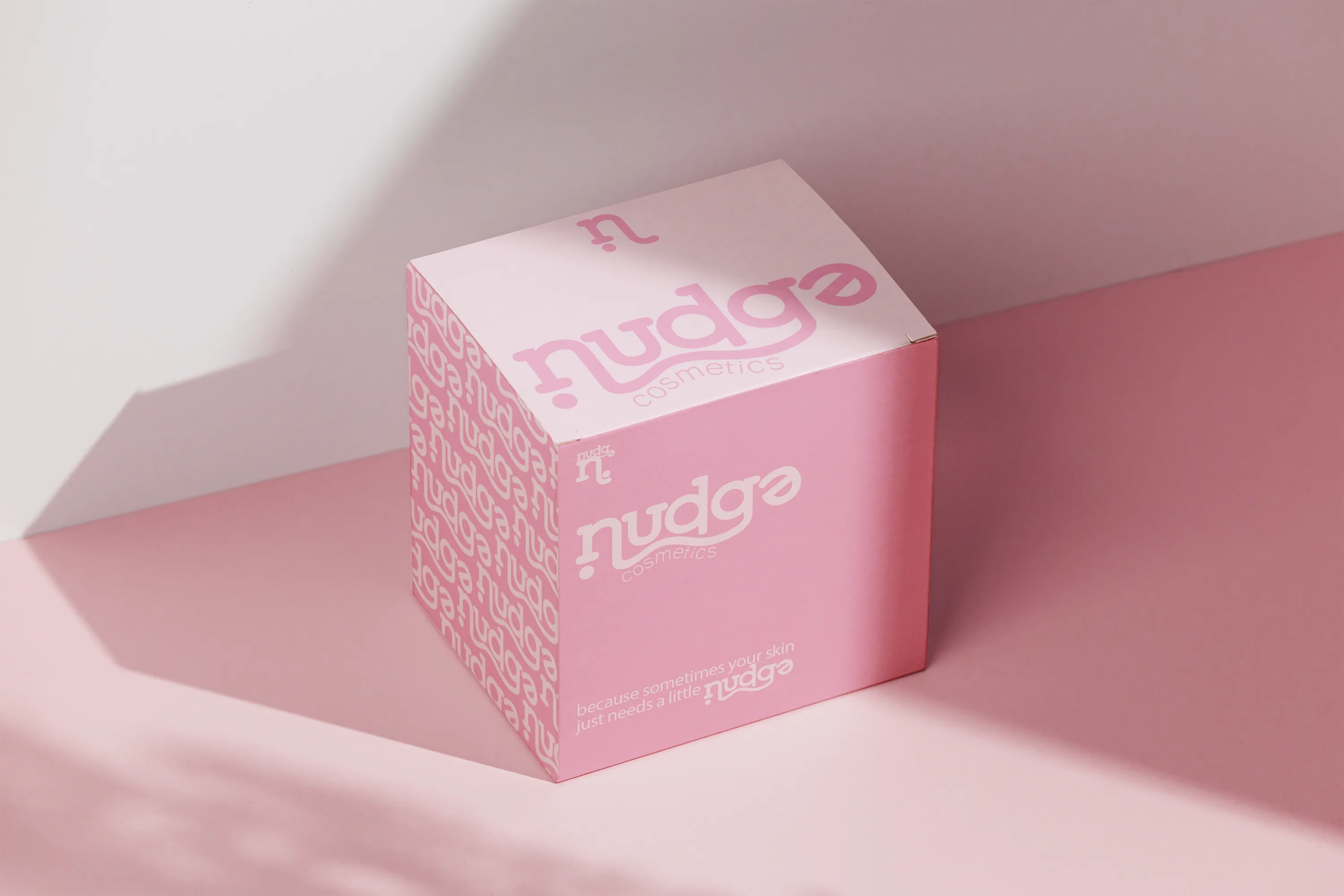
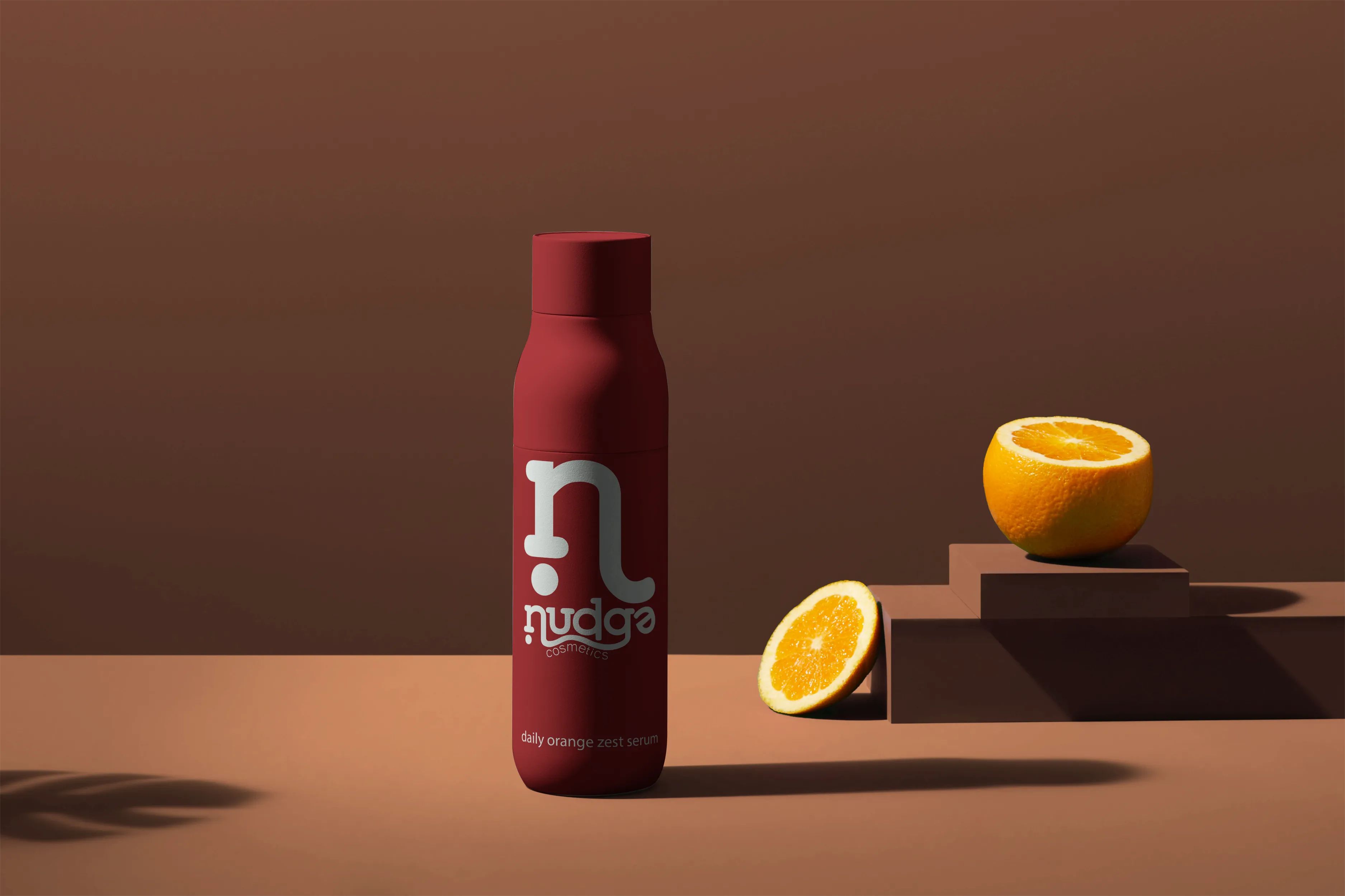
A playful, Gen-Z-forward cosmetics brand built around bold colour and a sense of joyful self-expression. This brand focuses on simple ingredients and minimal additives- because sometimes your skin just needs a little nudge.
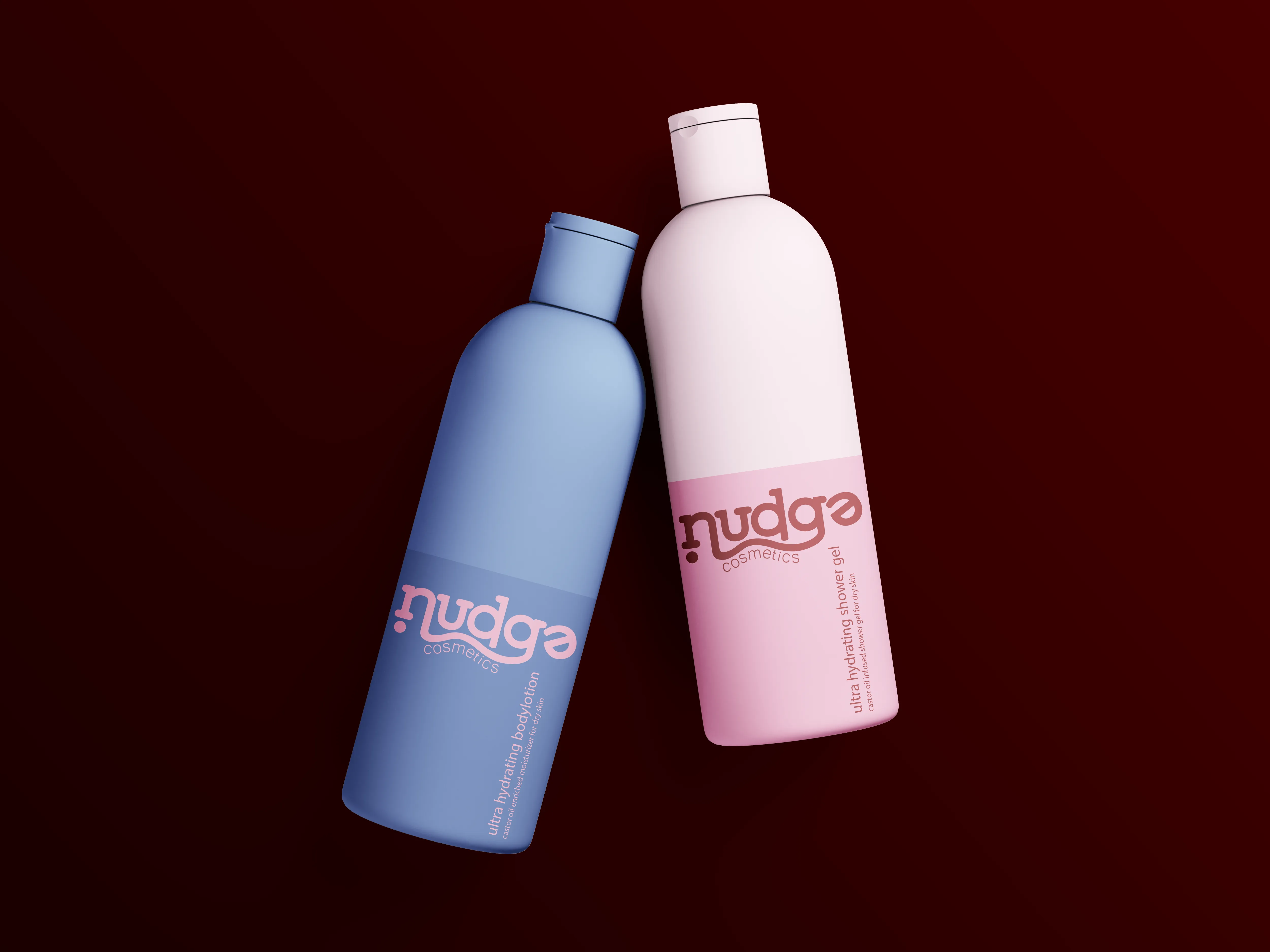
Nudge Cosmetics
The moodboard captures the playful, skin-positive energy the brand is built on. The colours are chosen to attract a young audience combining both bold and pastel hues for a contrasting, dynamic image.
Nudge Cosmetics
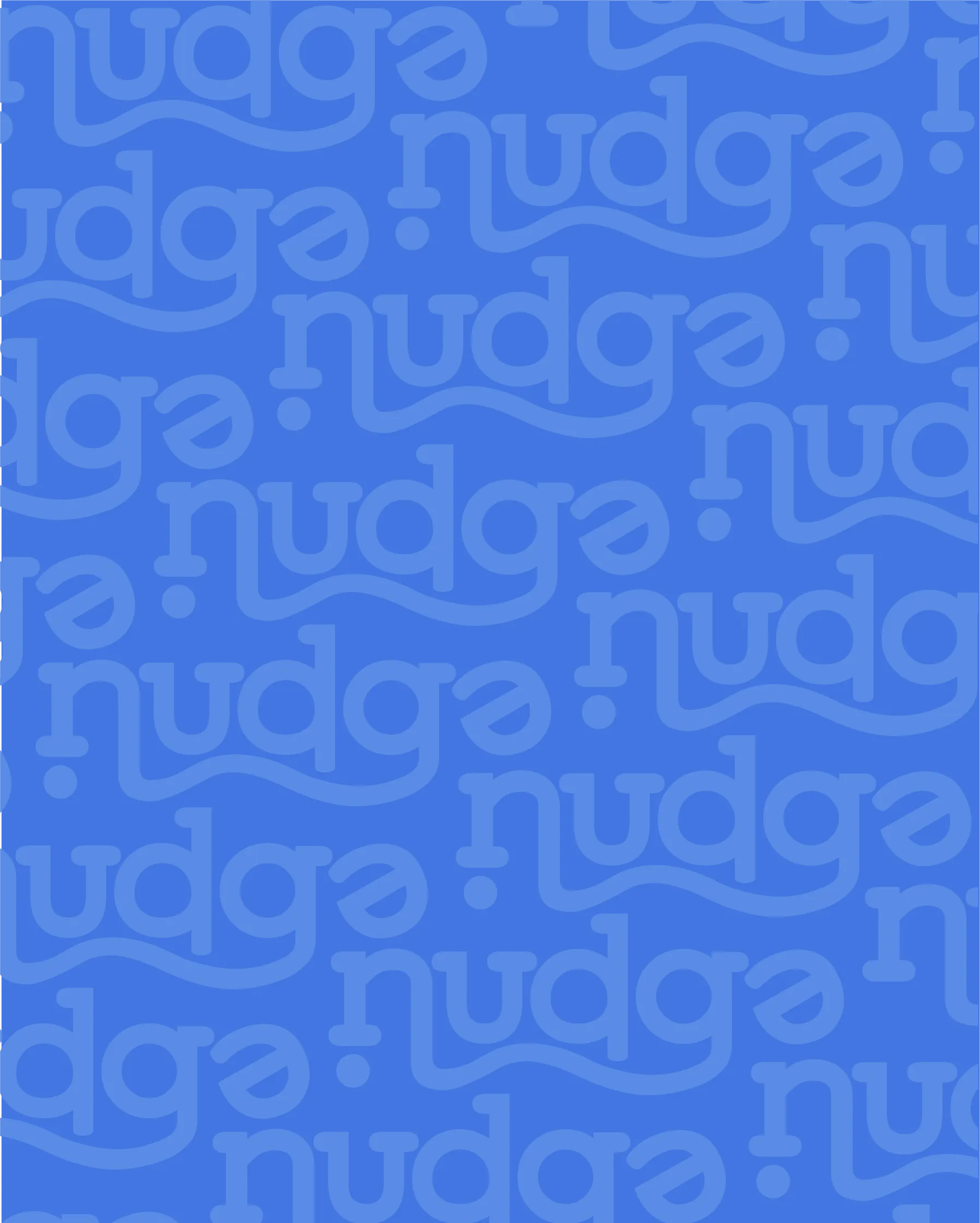
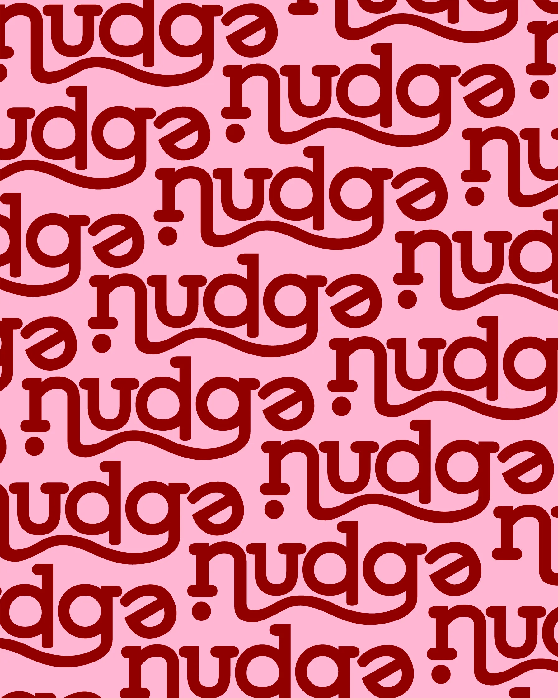
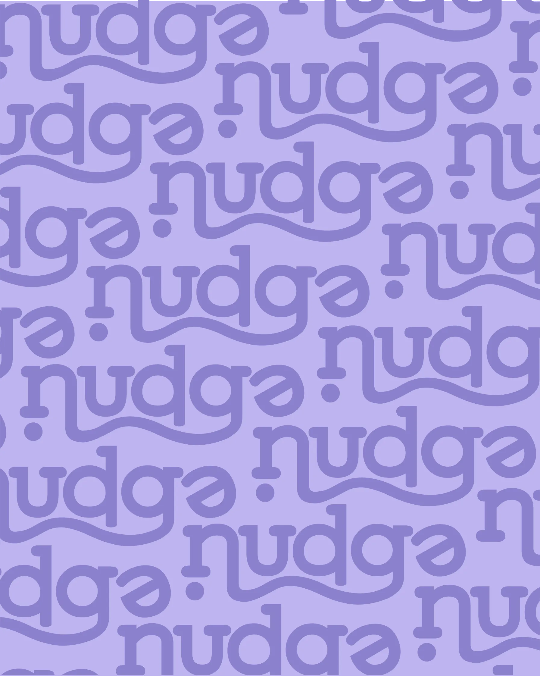
A custom wordmark with playful, rounded letterforms and a flowing wave underline. To convey the brand's mission, we broke up the lettering and gave the 'e' a little nudge.
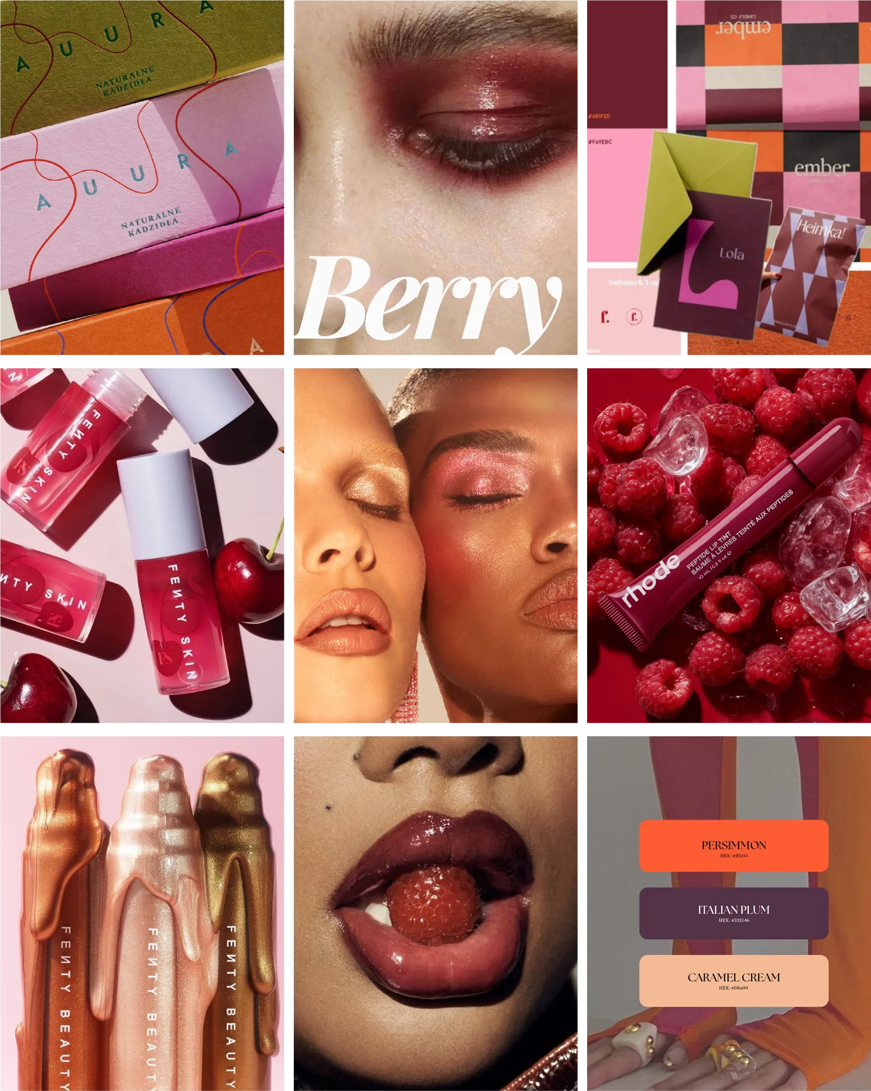
Case Study 02
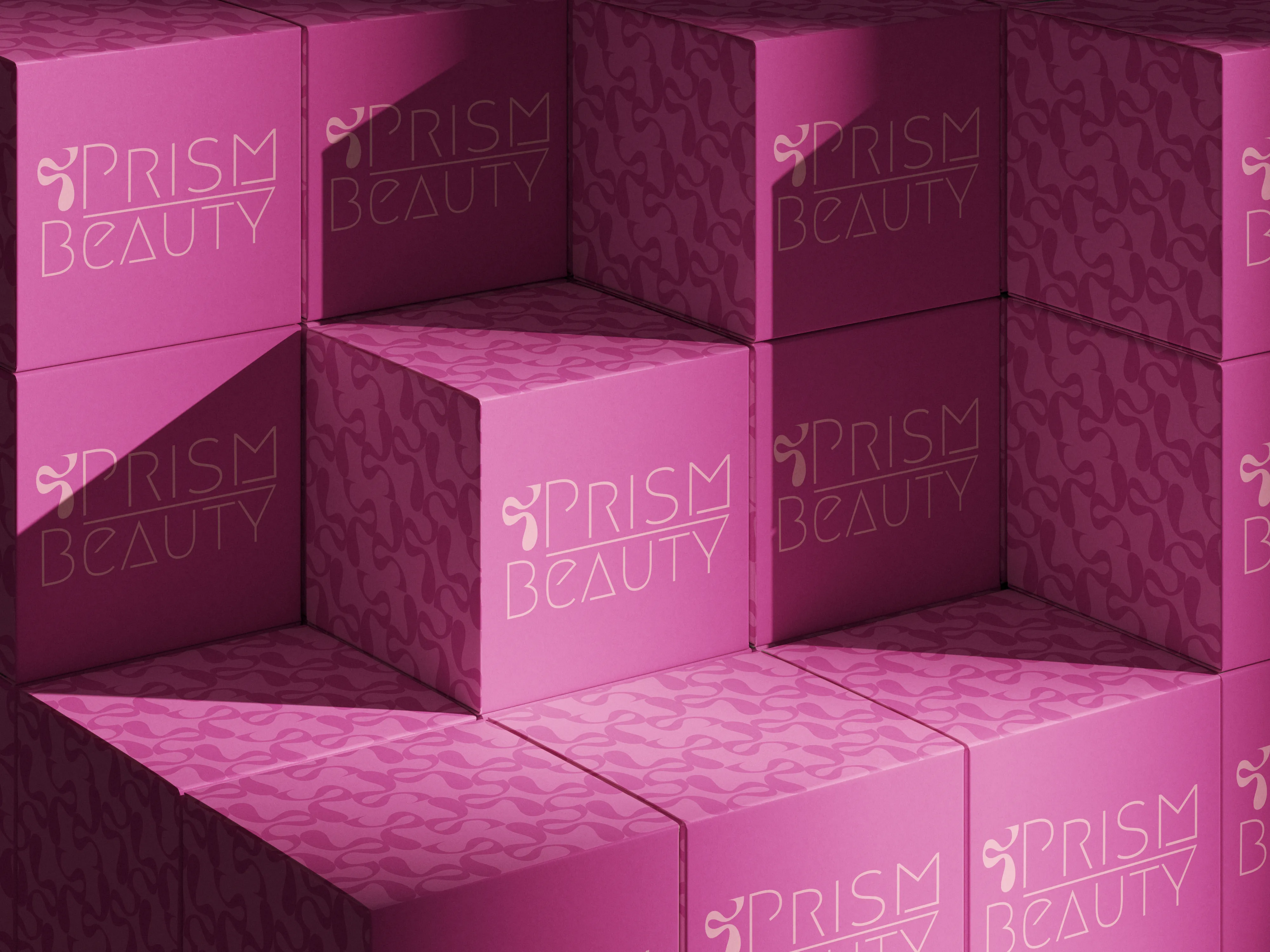
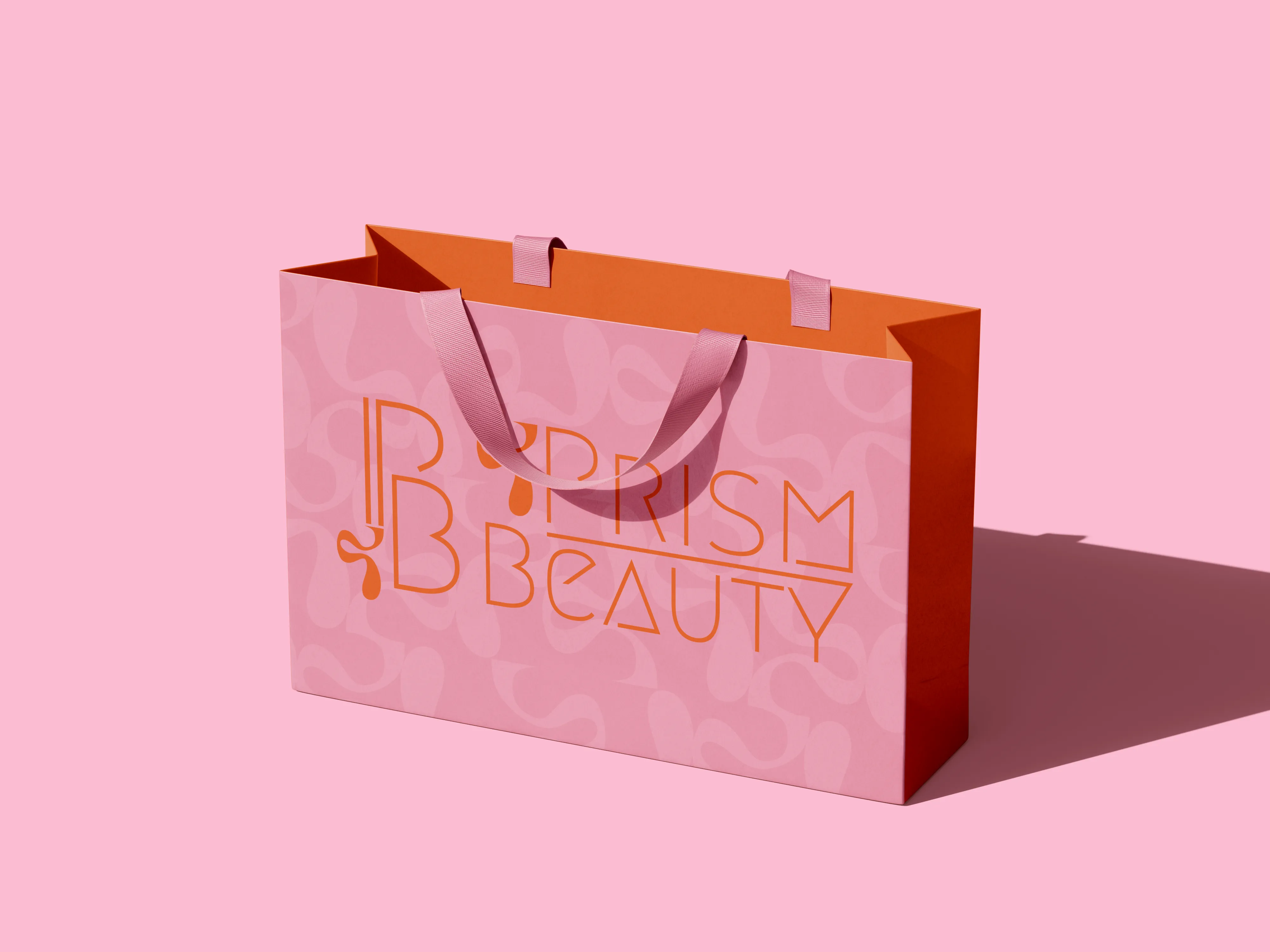
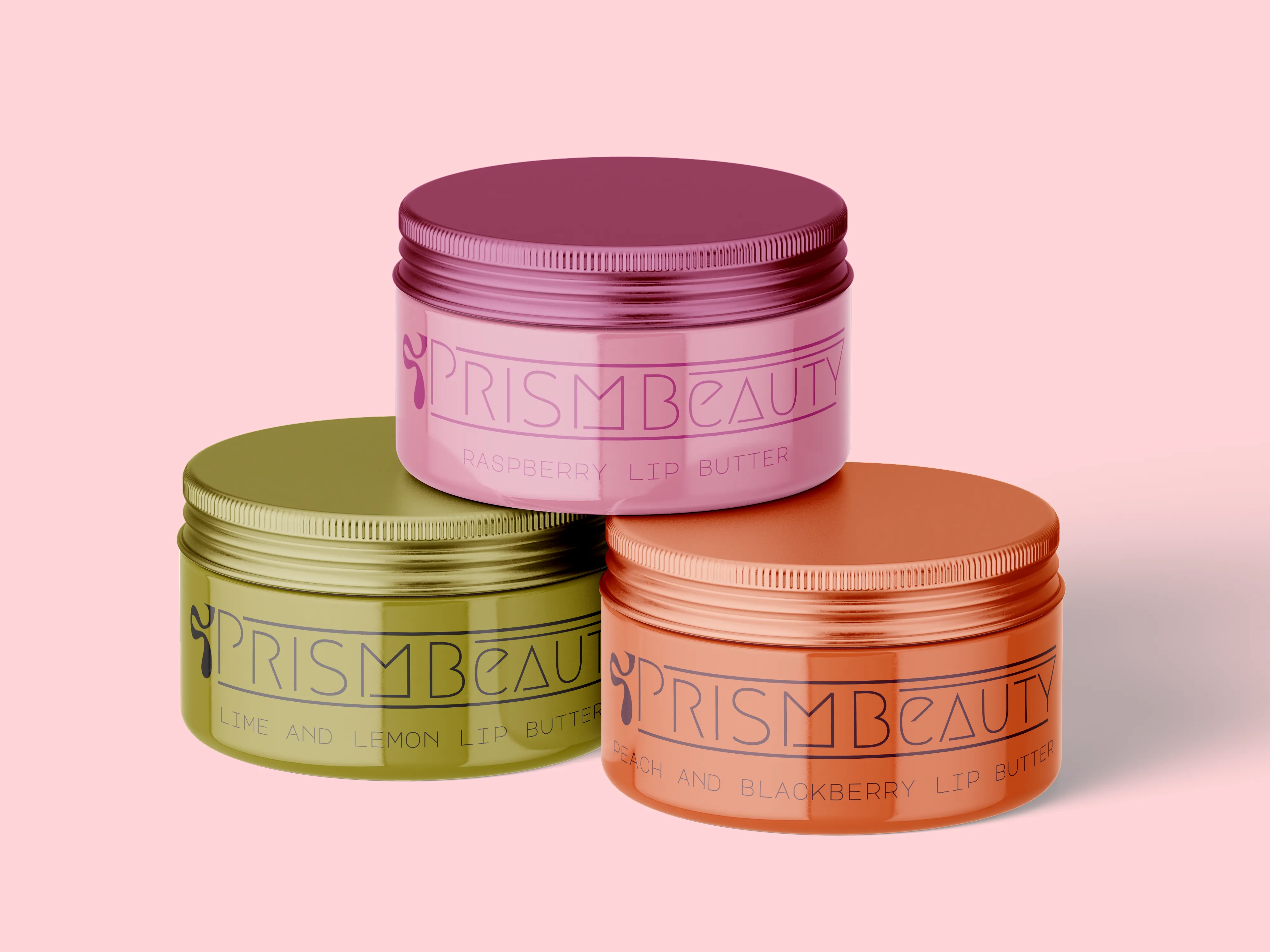
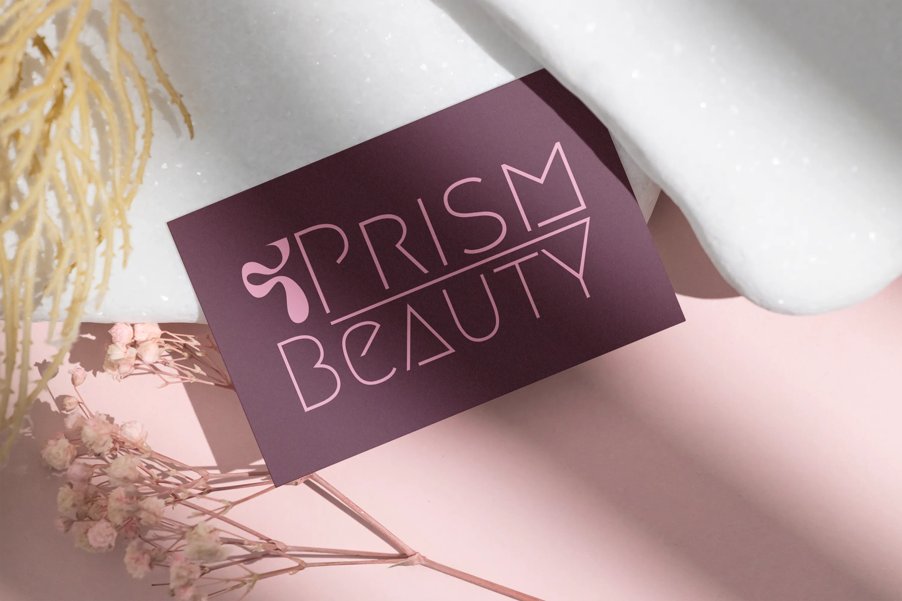
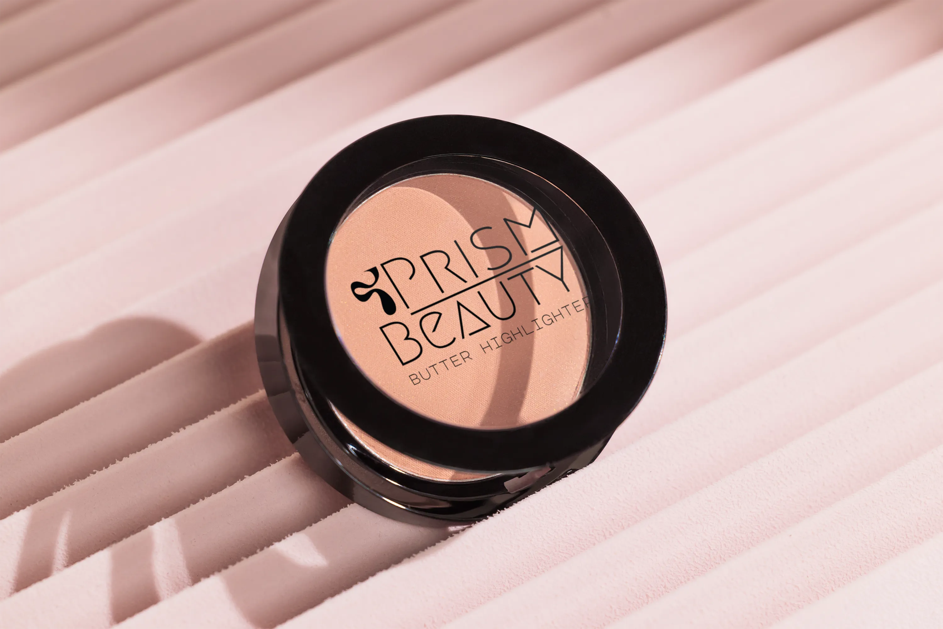
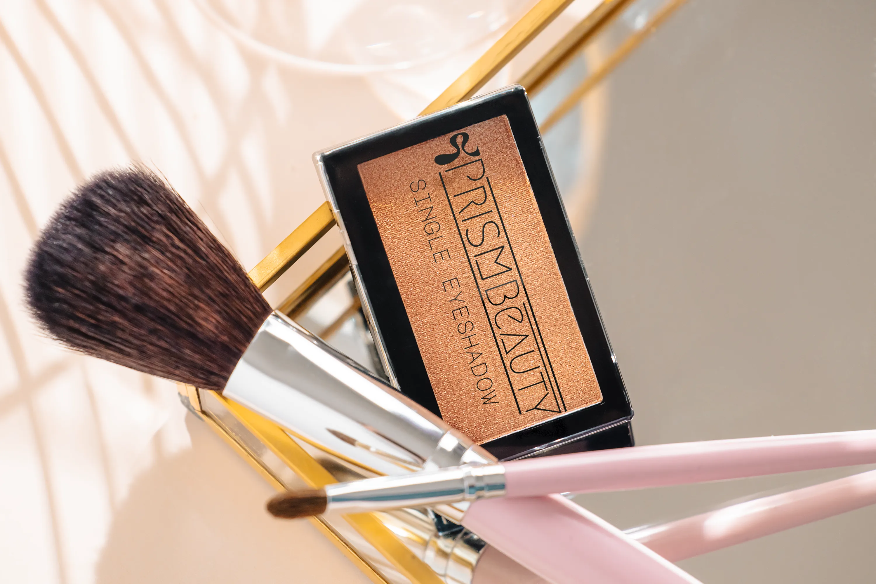
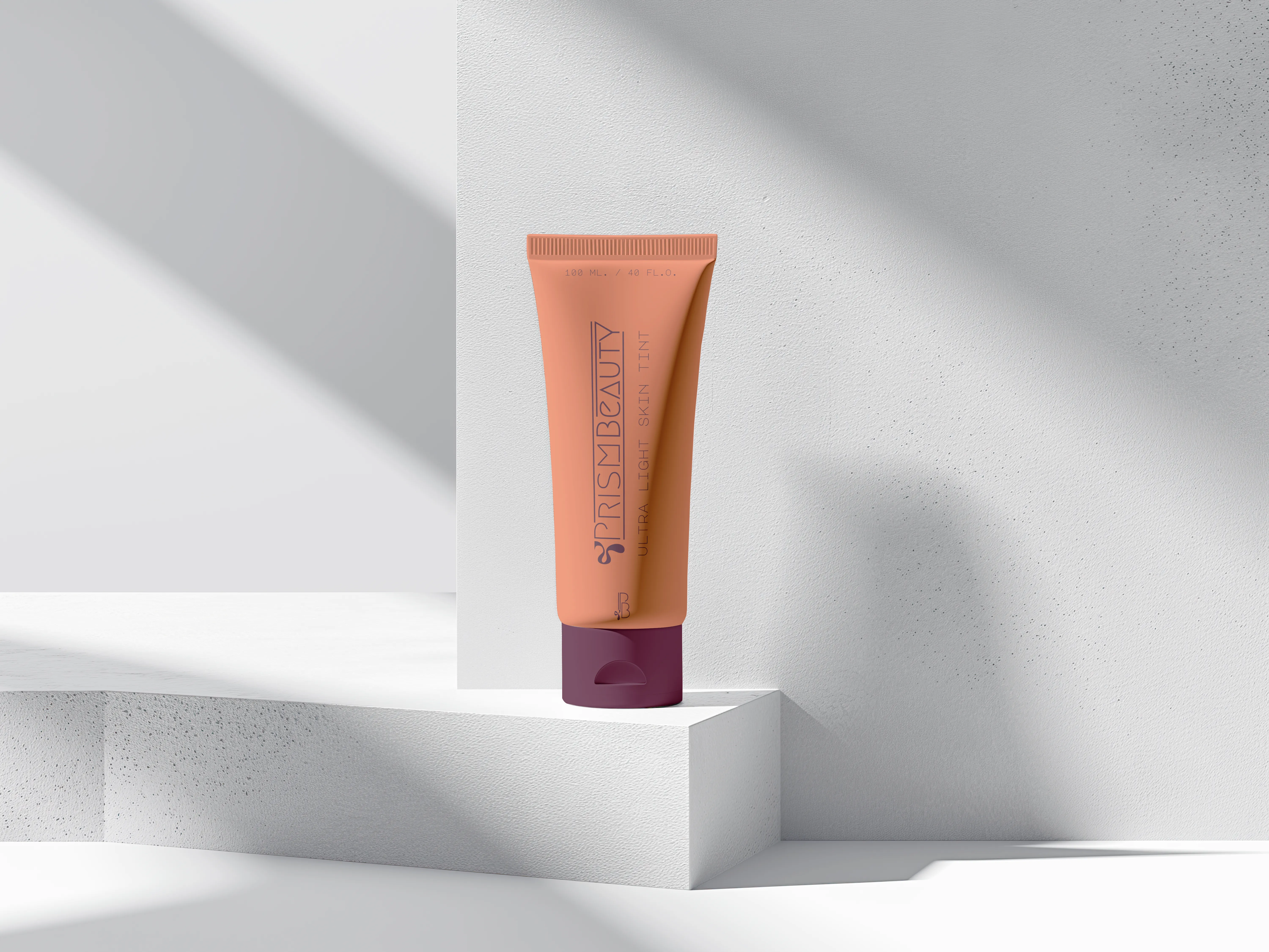
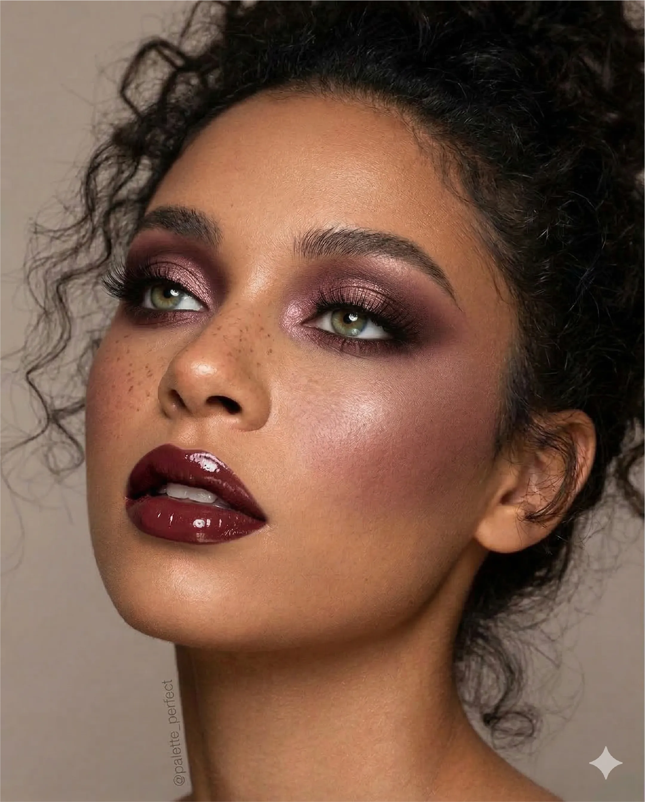
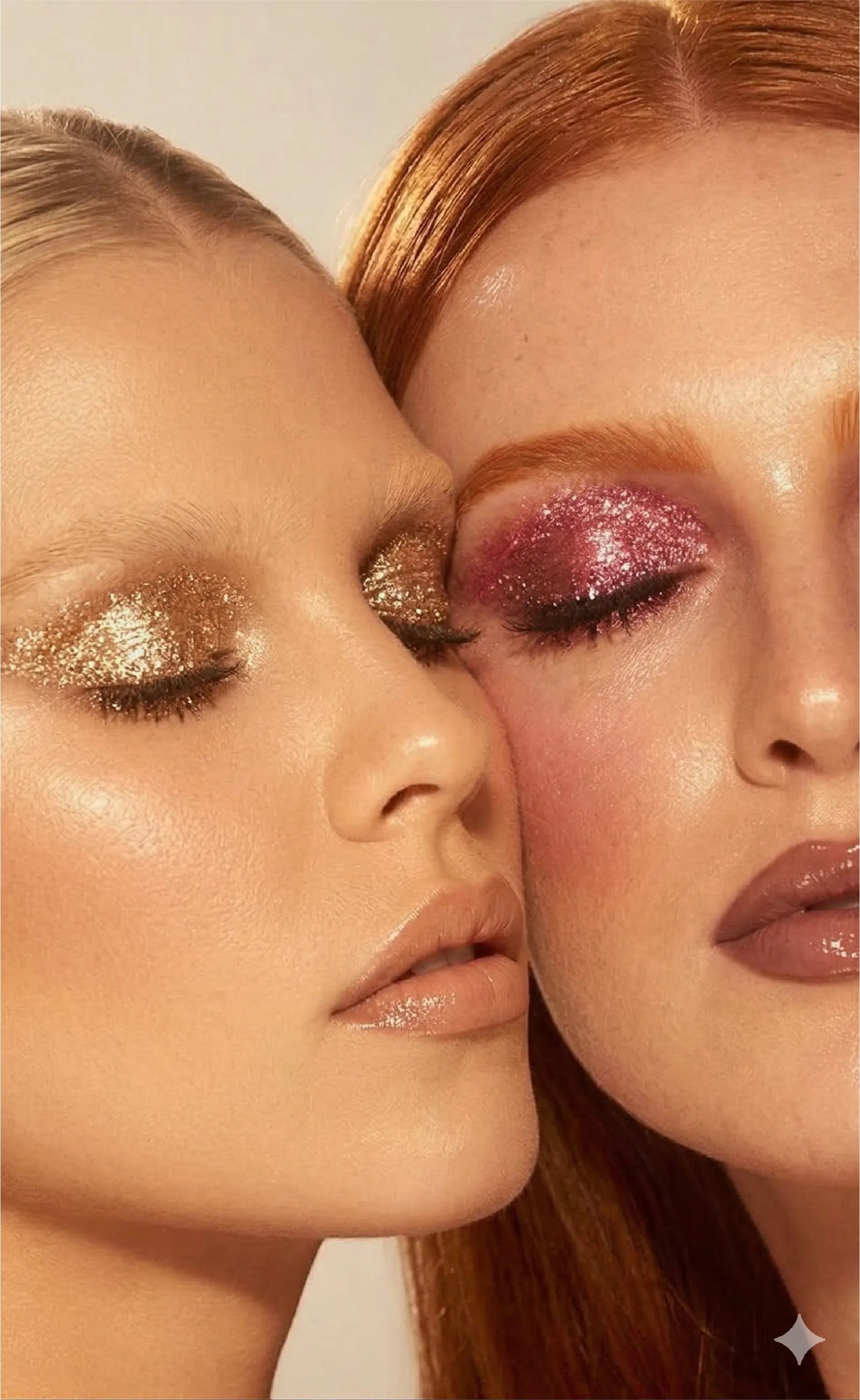
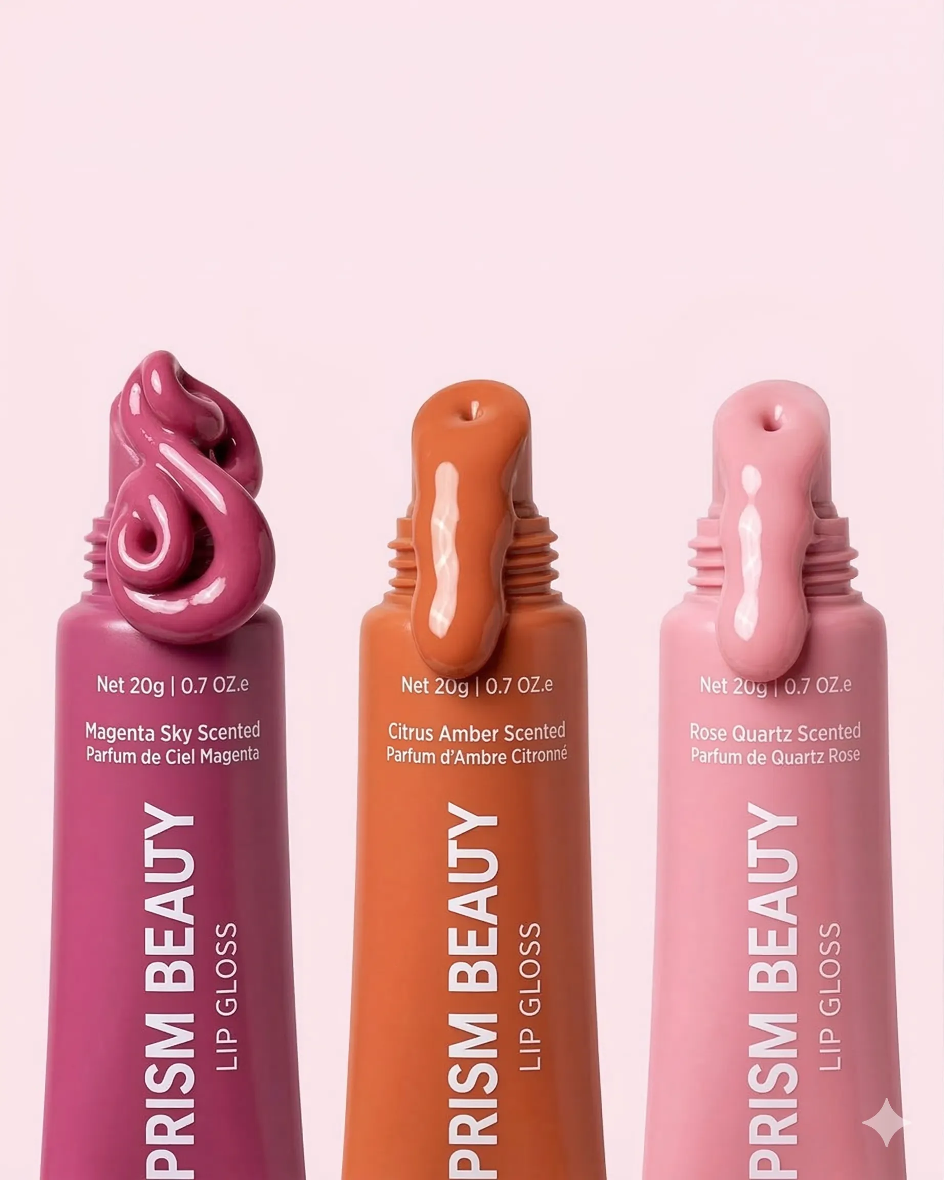
A premium, editorial beauty brand with warm earth tones, Art Deco-inspired typography, and a rich colour story rooted in berry, olive, and burnt orange. Designed to feel luxurious yet approachable.
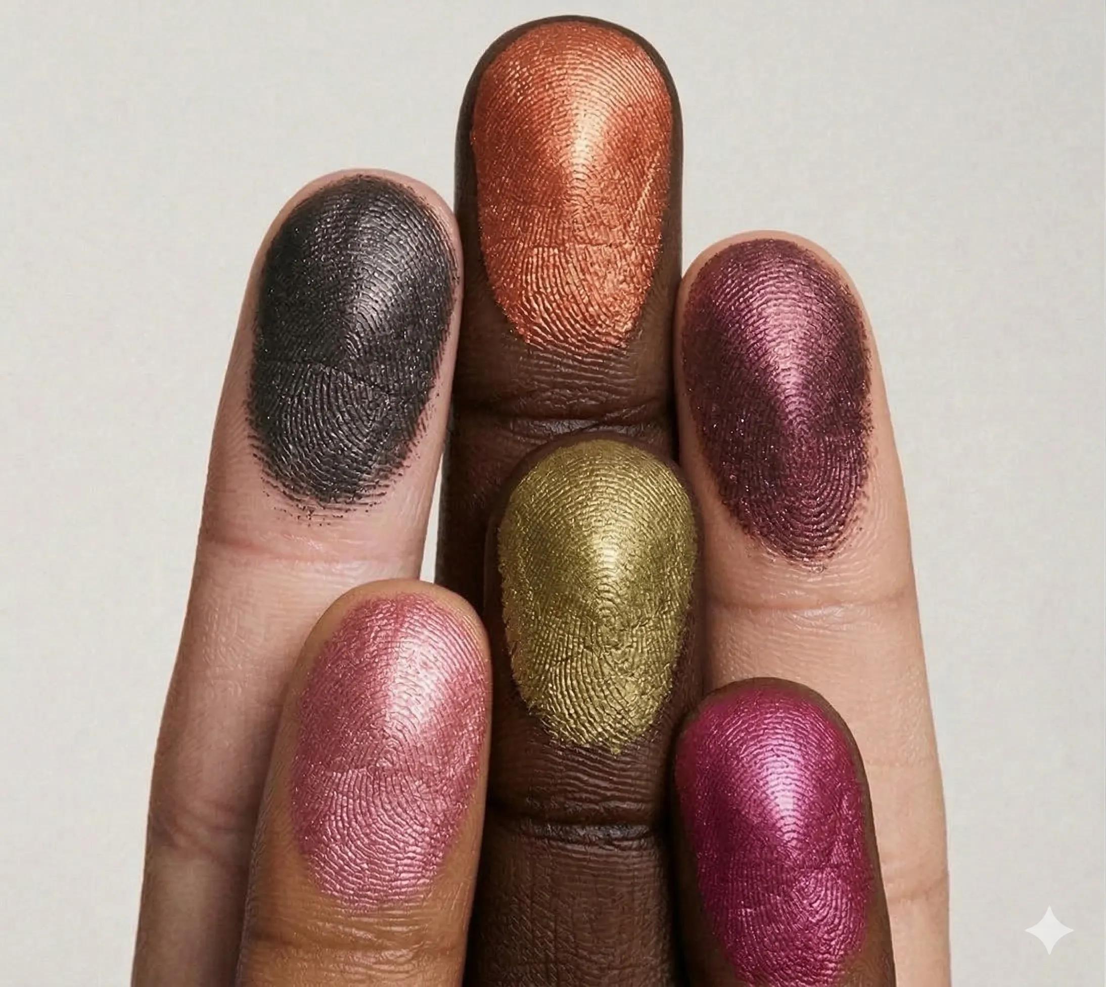
Prism Beauty
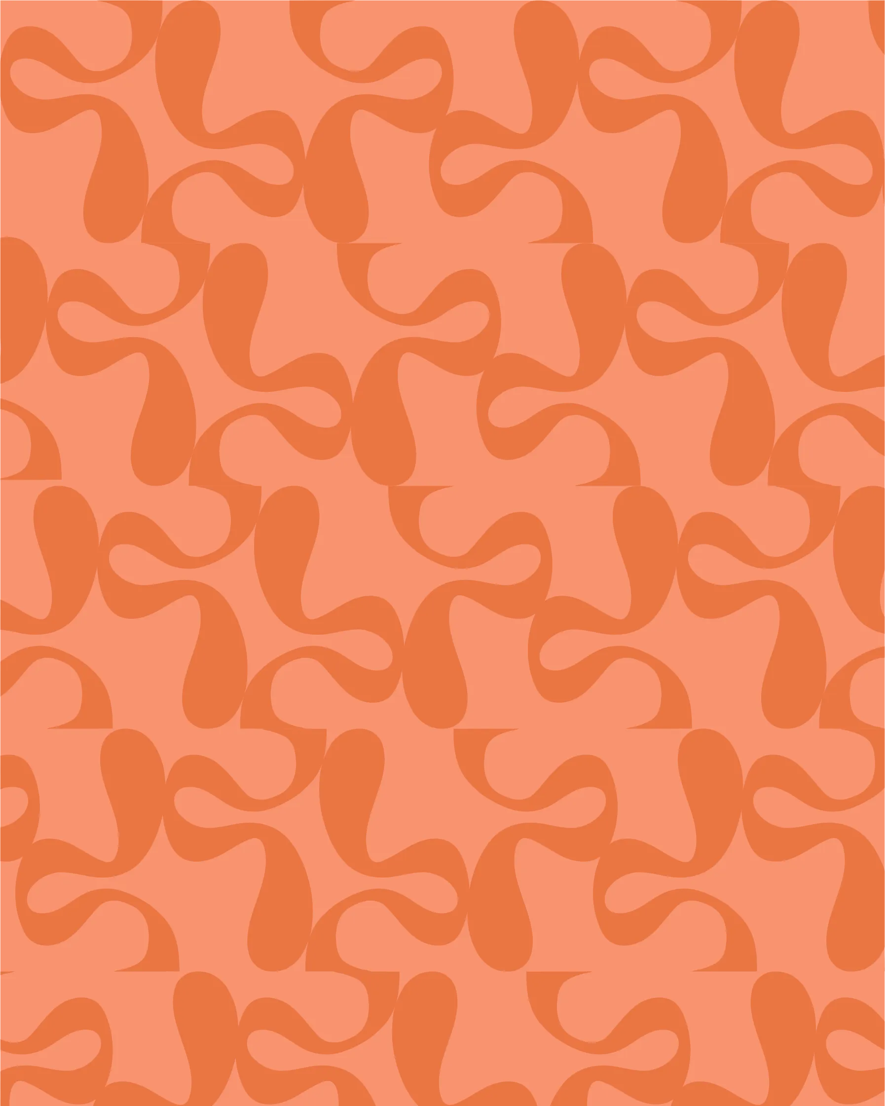
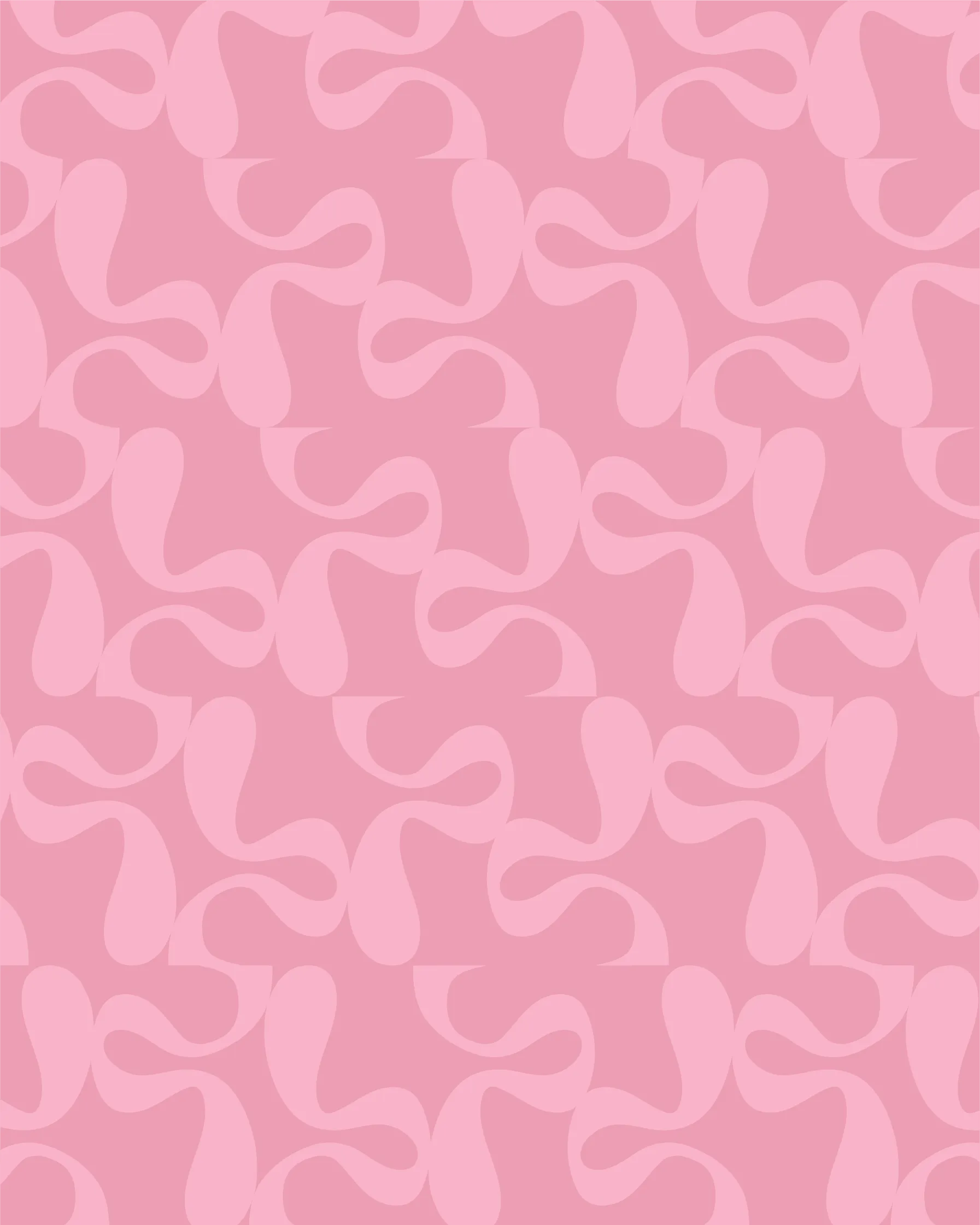
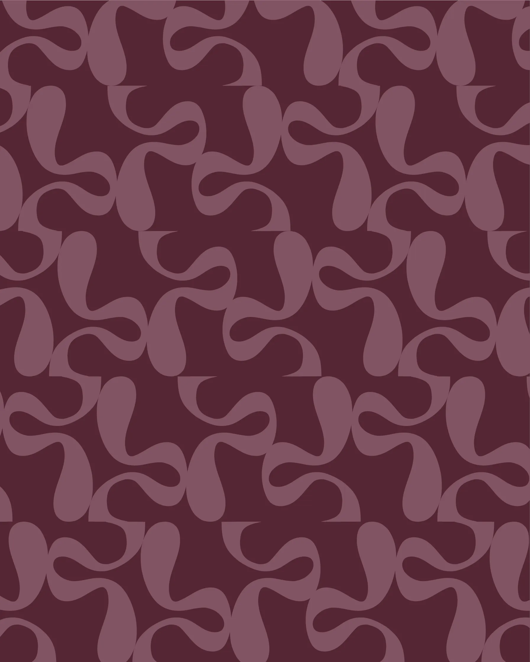
The moodboard channels glamour with an artisanal edge. With a warm and earthy color story, we create a luxurious yet comforting atmosphere.
Prism Beauty
An Art Deco-inspired wordmark with geometric letterforms and a distinctive icon featuring an organic, fluid droplet motif..
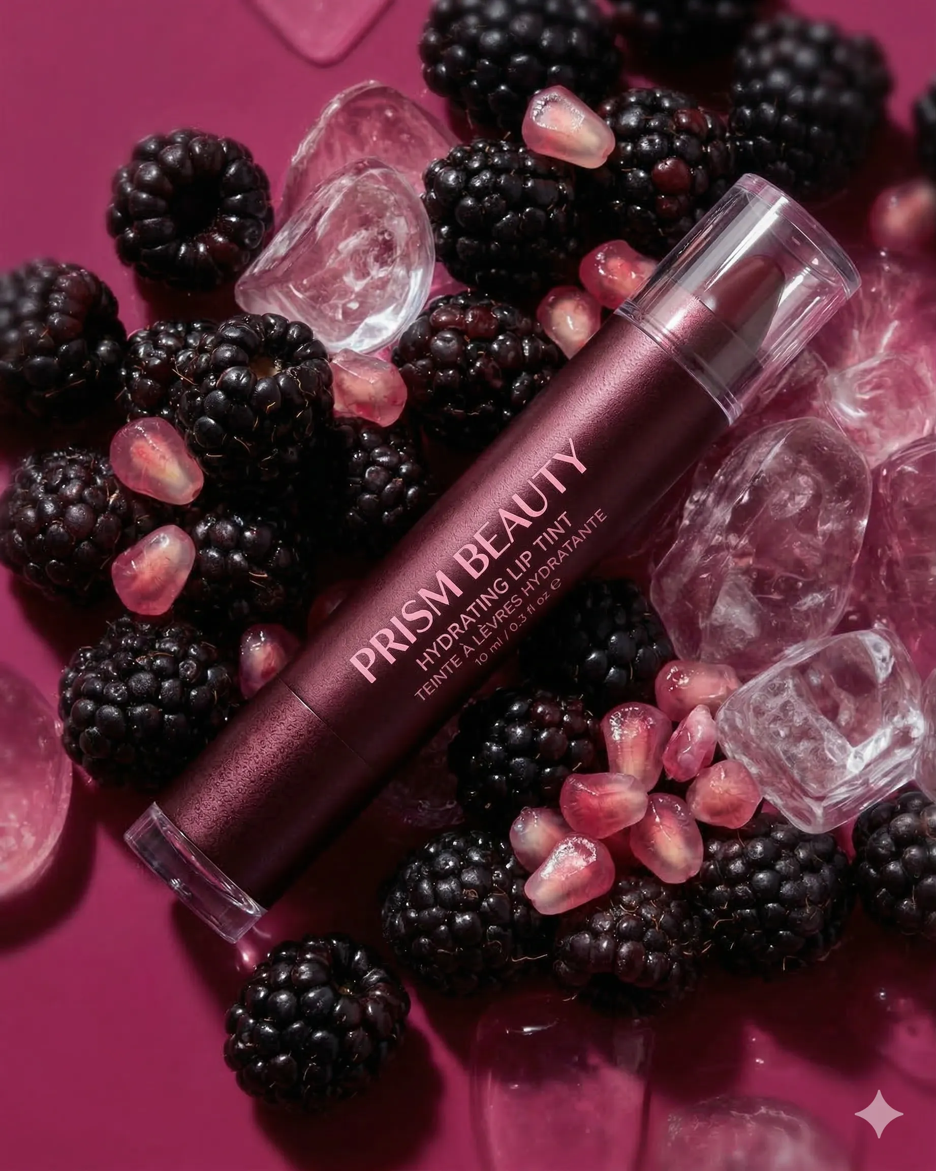
Prism Beauty
The luxurious, old-world aesthetic of the brand is represented in a monochrome ad that stimulates the senses.

Case Study 03
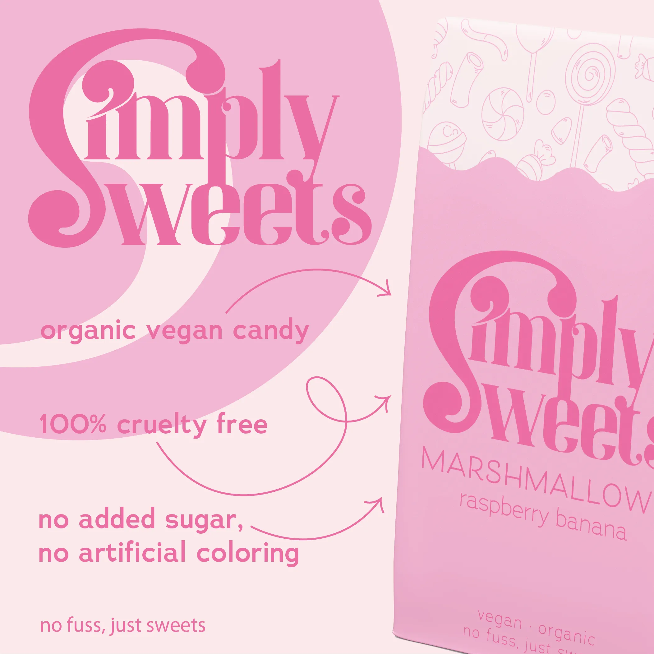
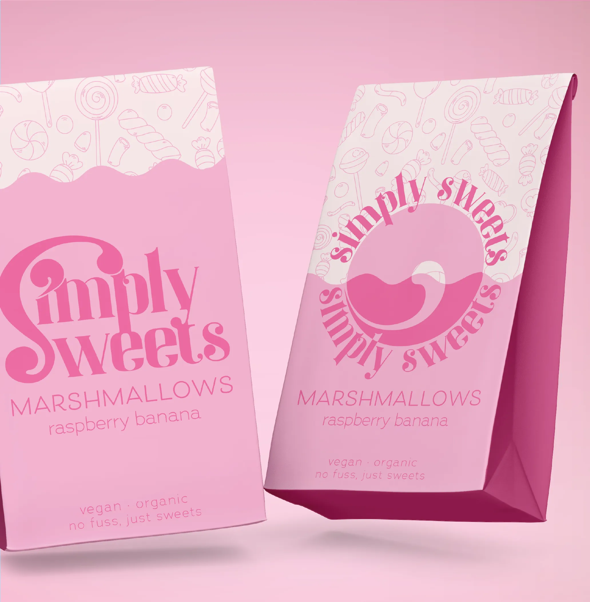
A playful, vibrant vegan candy brand built around bold colour, retro typography — all organic, cruelty-free, and full of personality.
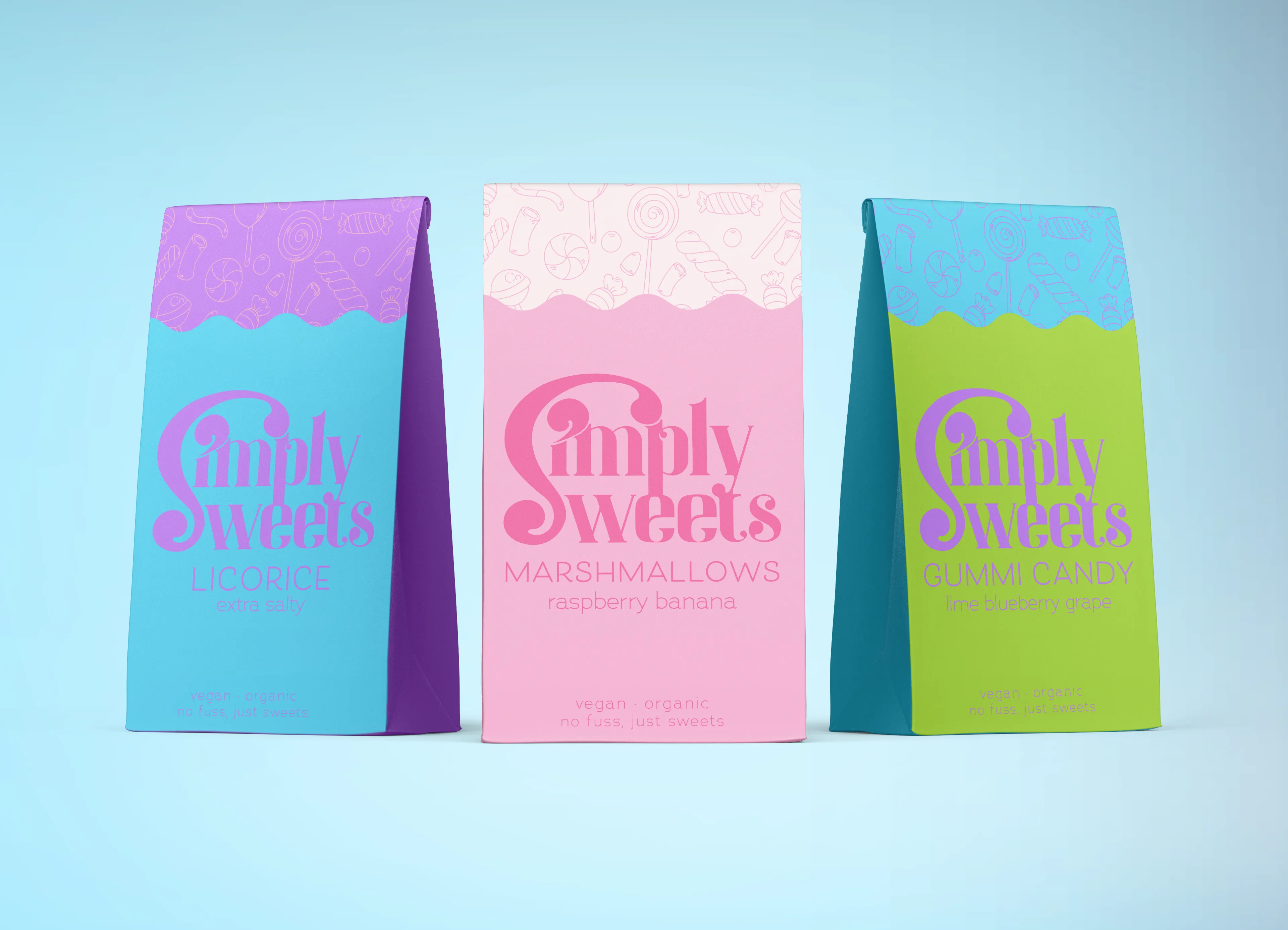
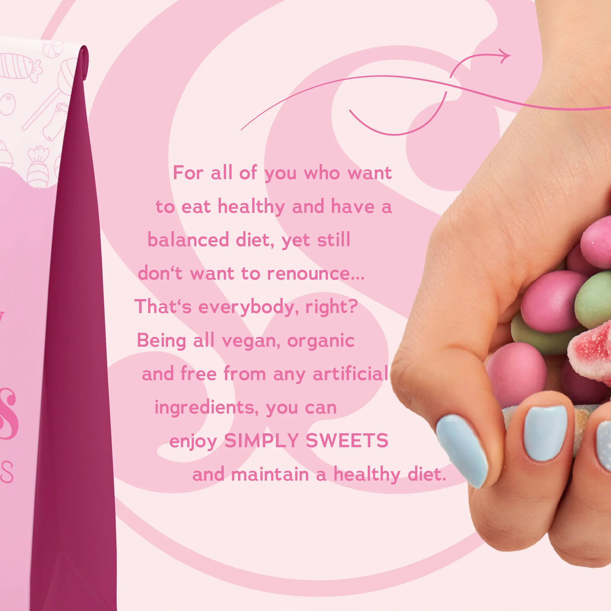
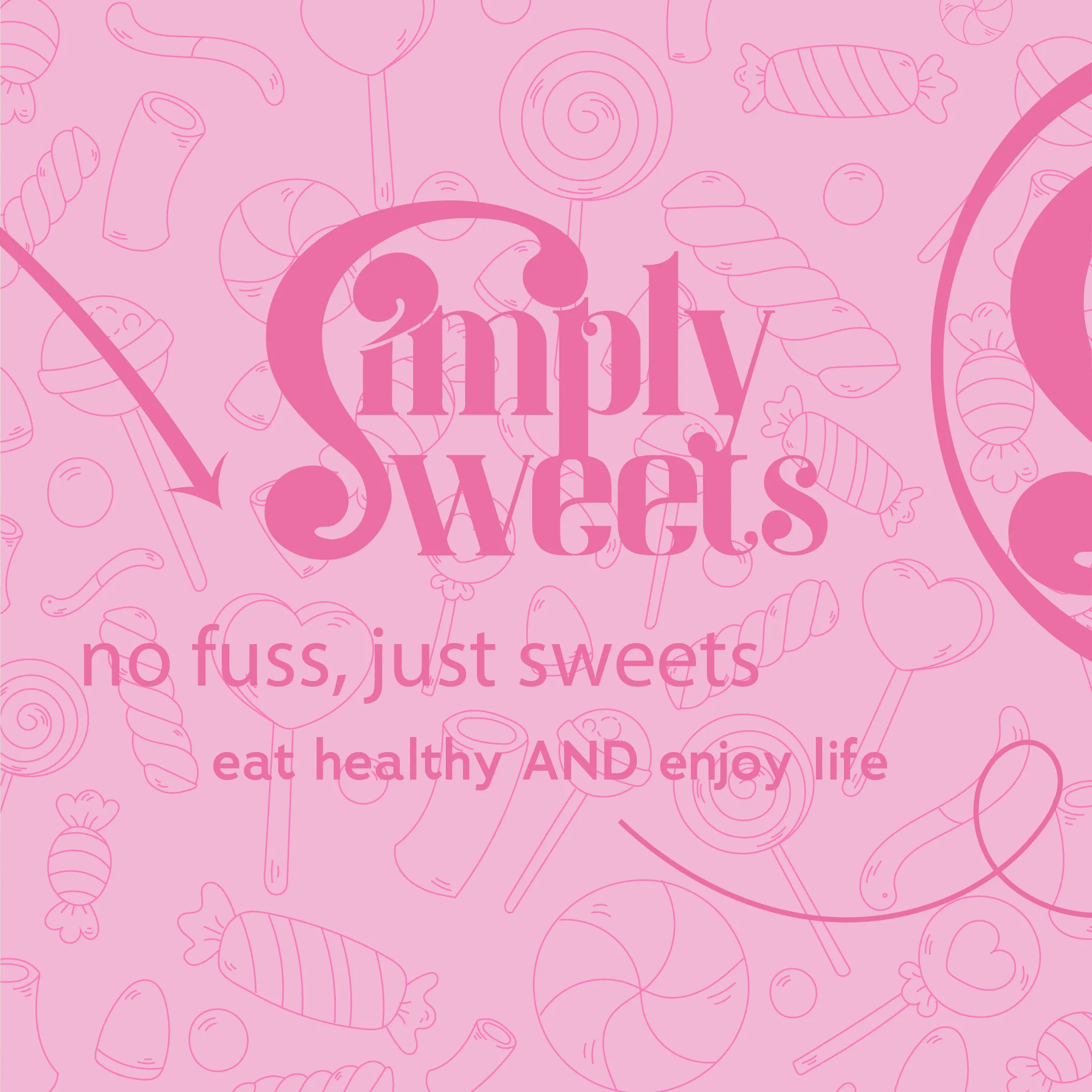
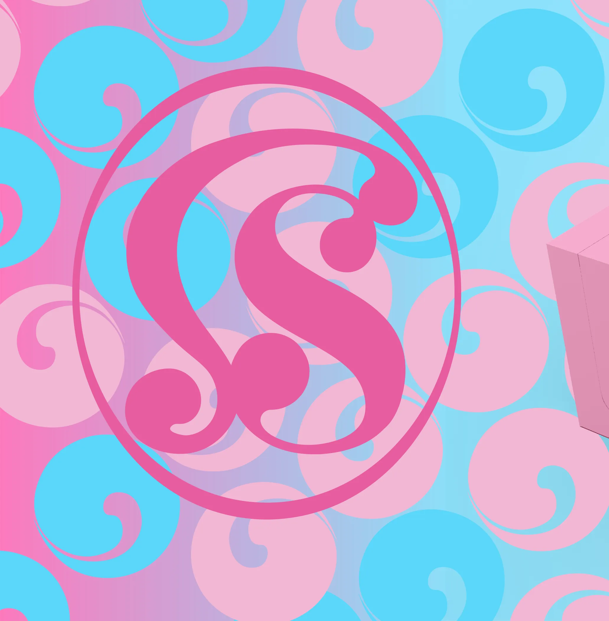
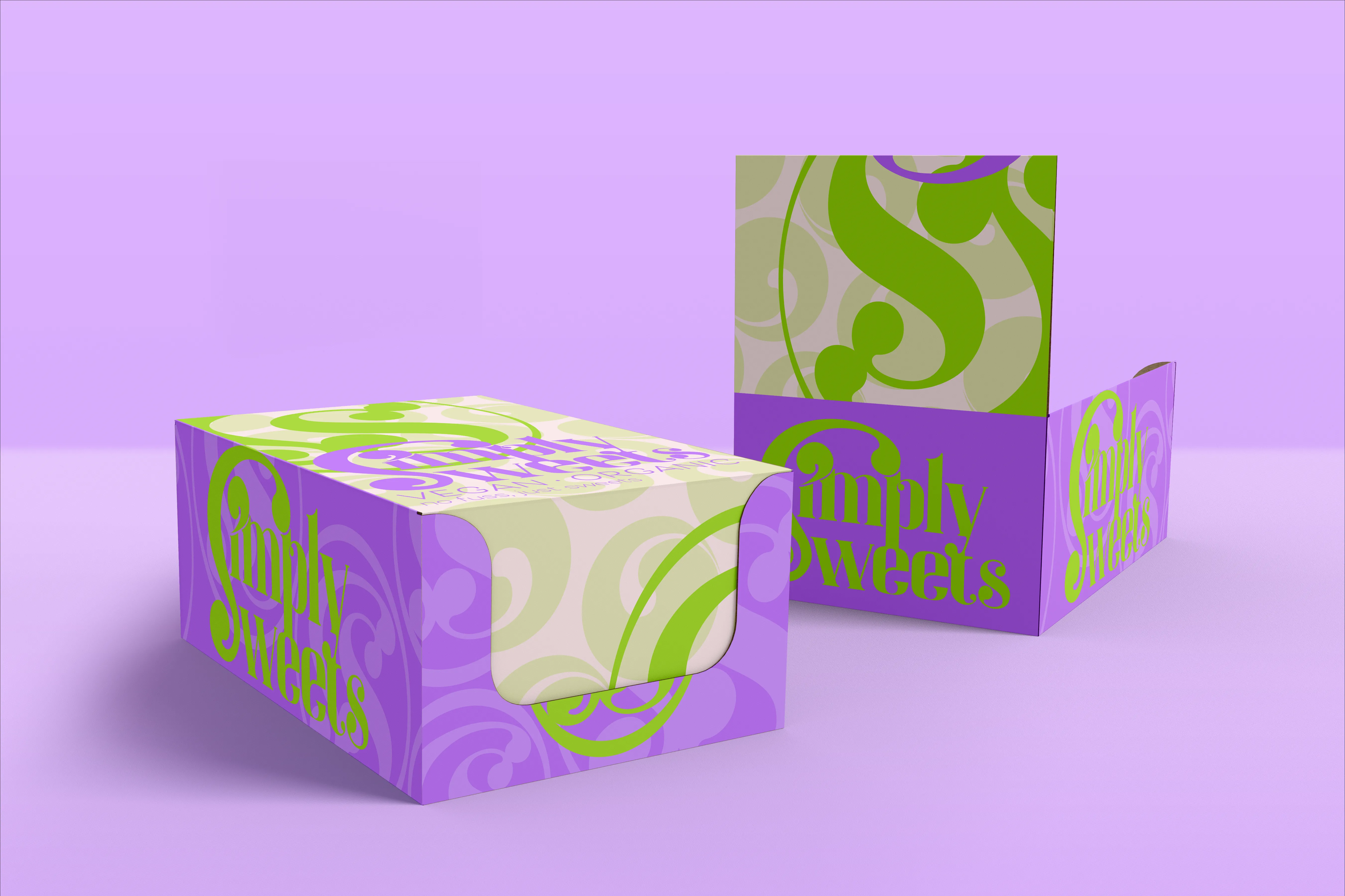
Simply Sweets
A sugar-rush palette of hot pink, electric blue, lilac, and lime green — drawing on candy-coated visuals, retro type, and maximalist energy. The moodboard captures the brand's playful, no-fuss attitude to sweets done right.
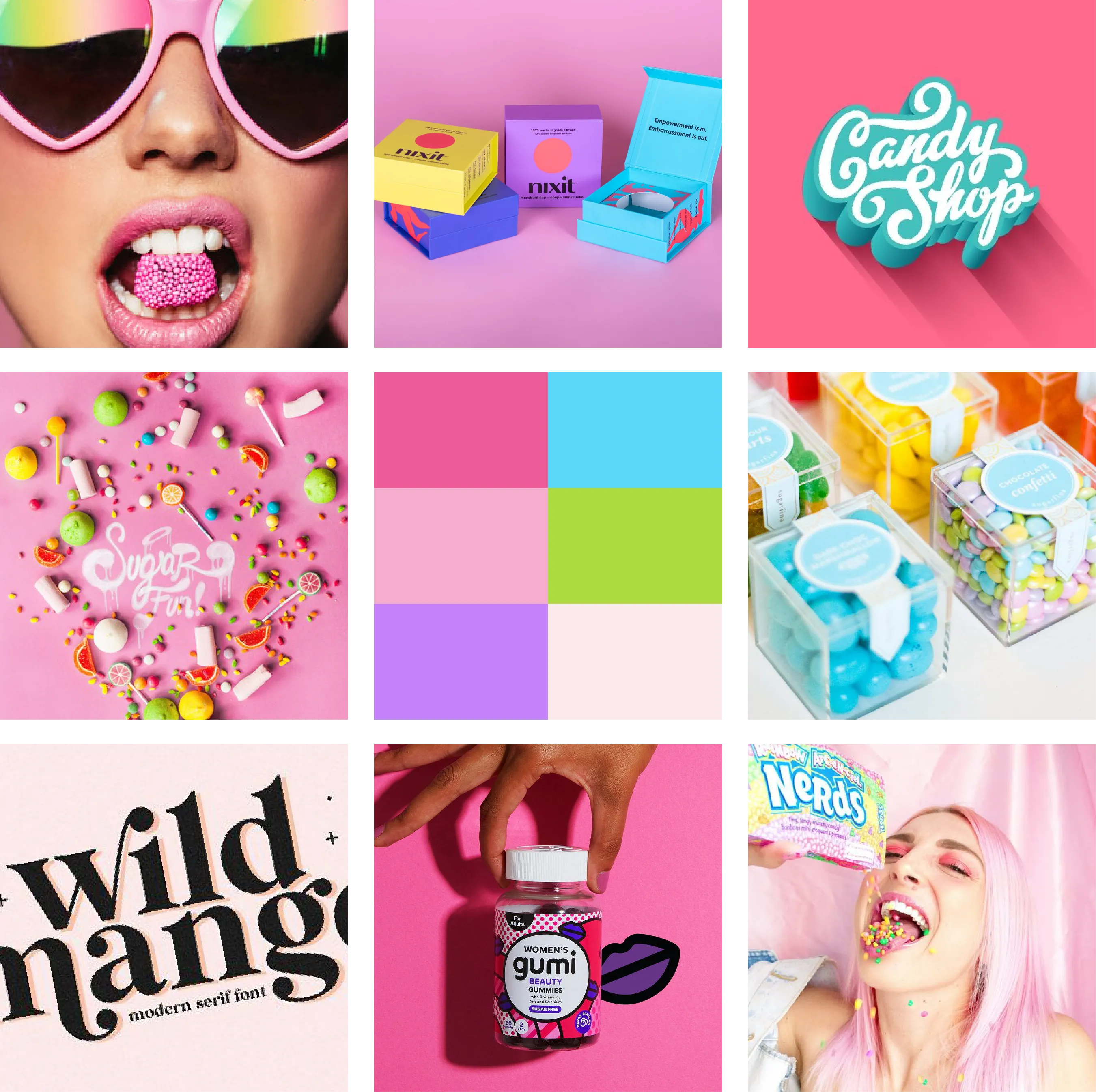
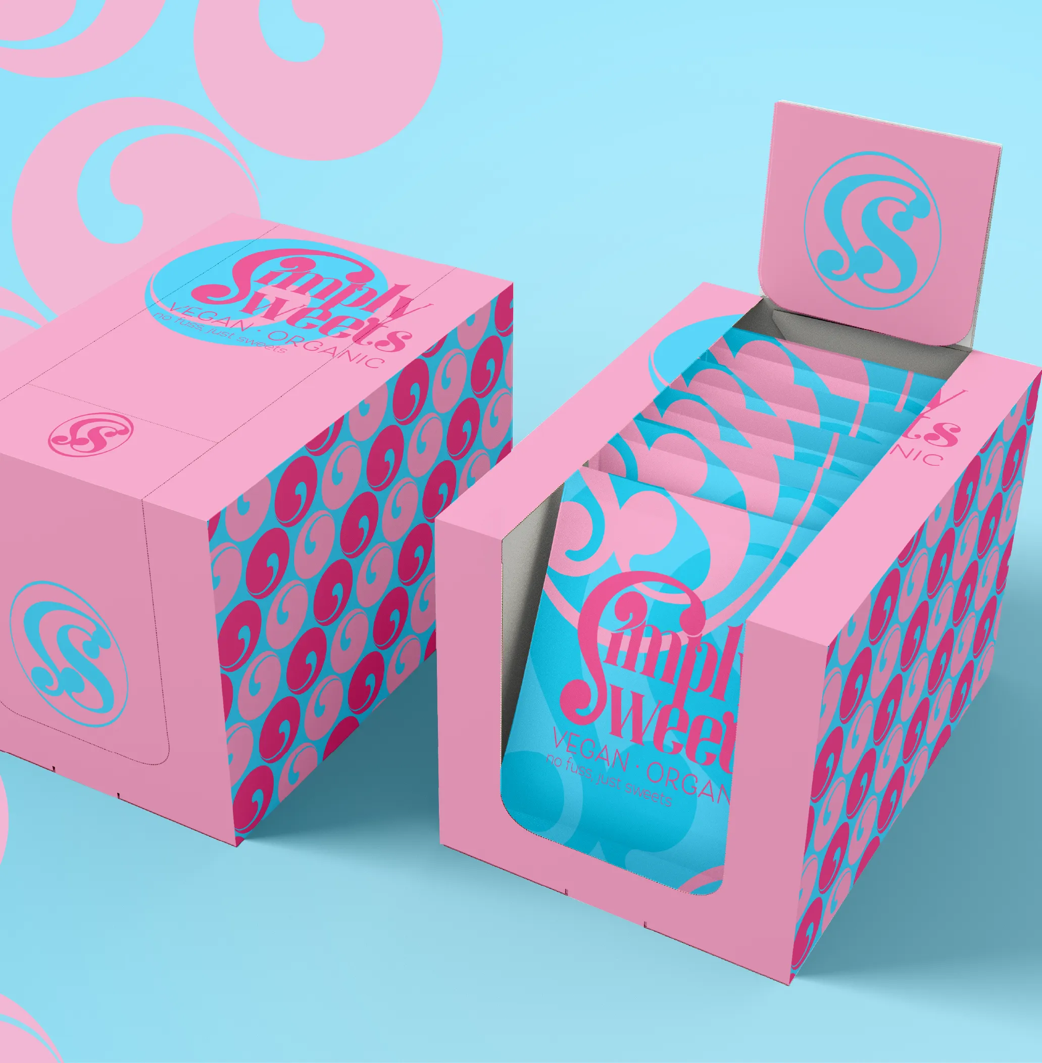
Simply Sweets
Making the brand approachable for the audience by bringing the colourful, energetic vibe to life in a visually enticing social media post.
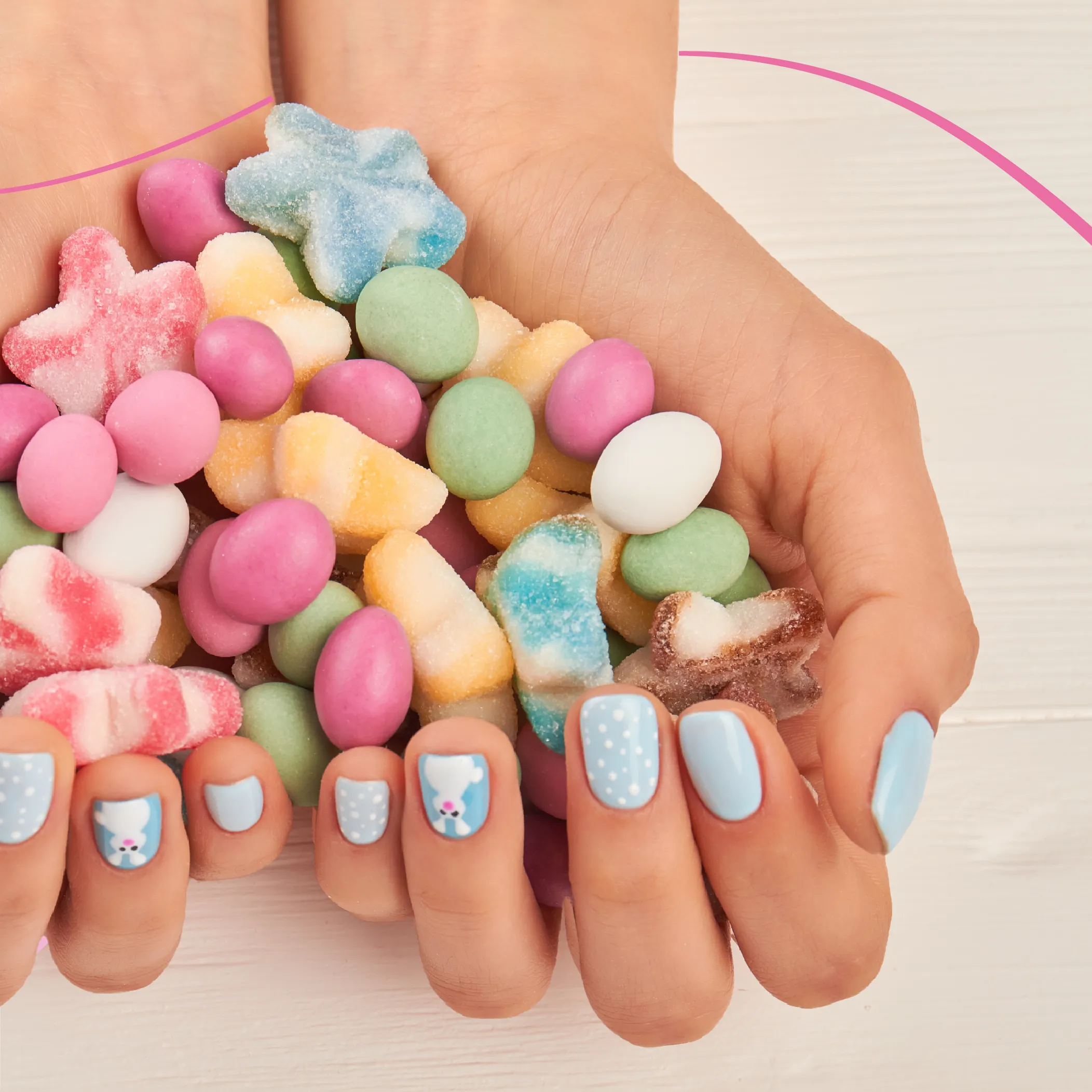
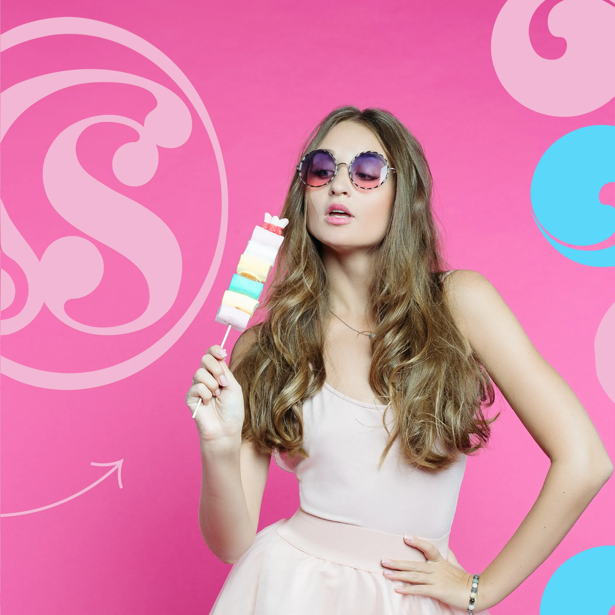
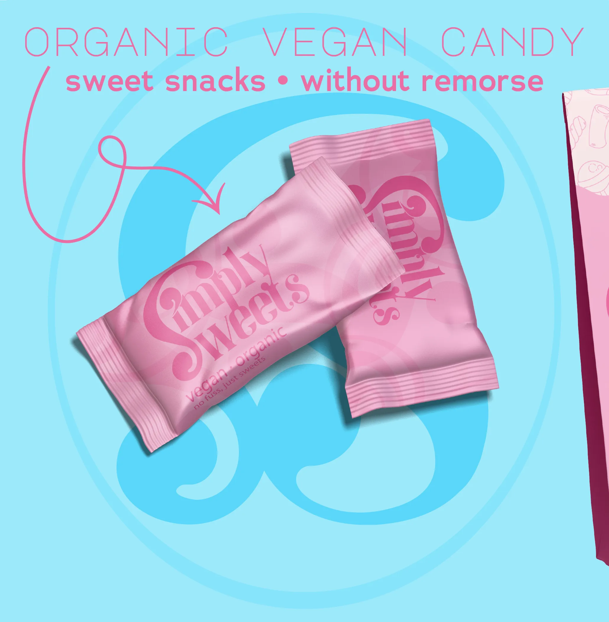
Simply Sweets
An attractive brand presentation that grabs attention by portraying the vibrant brand aesthetic in an eye-catching social media ad.
Case Study 04
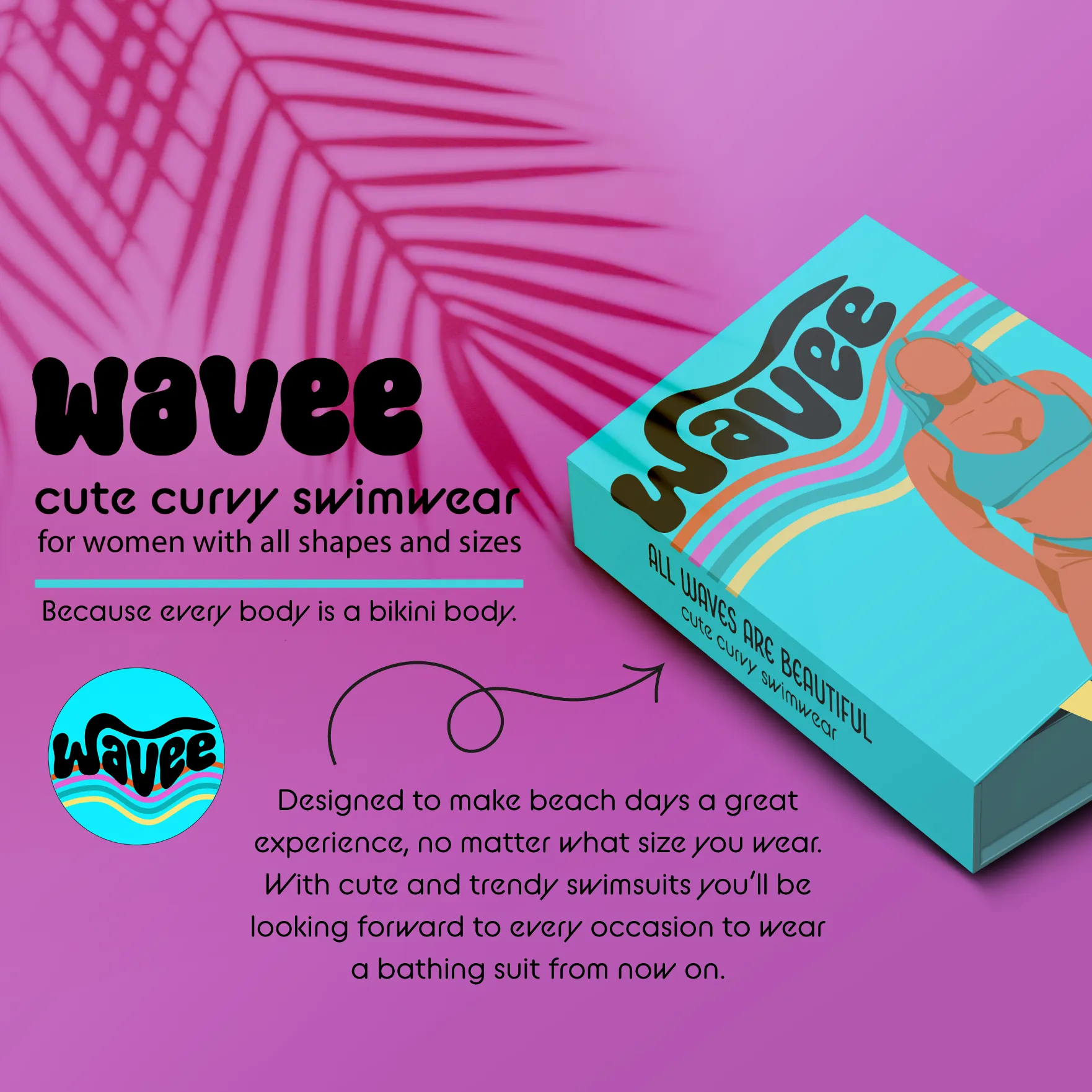
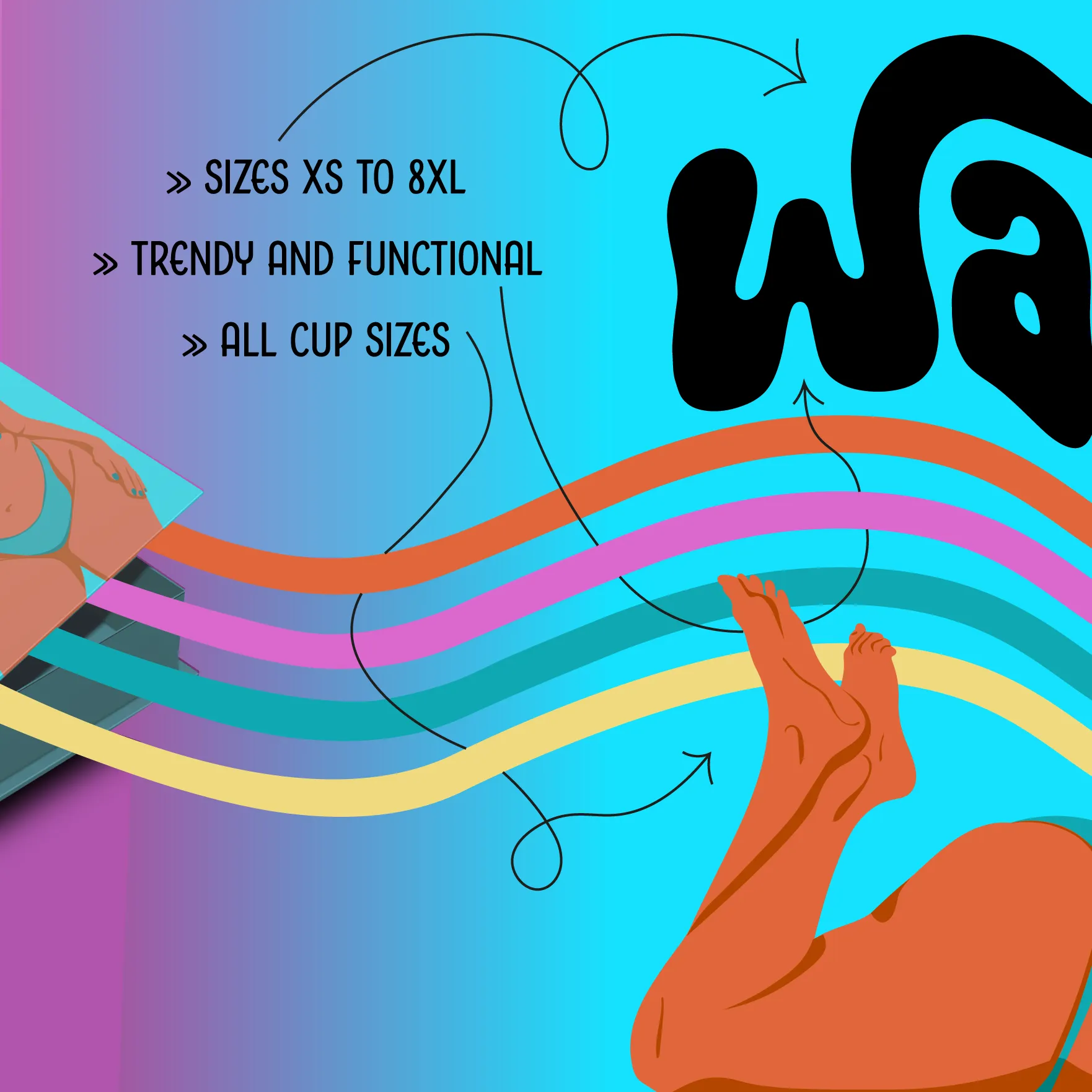
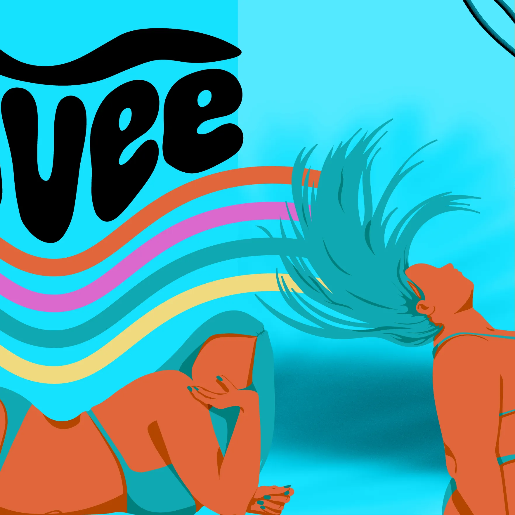
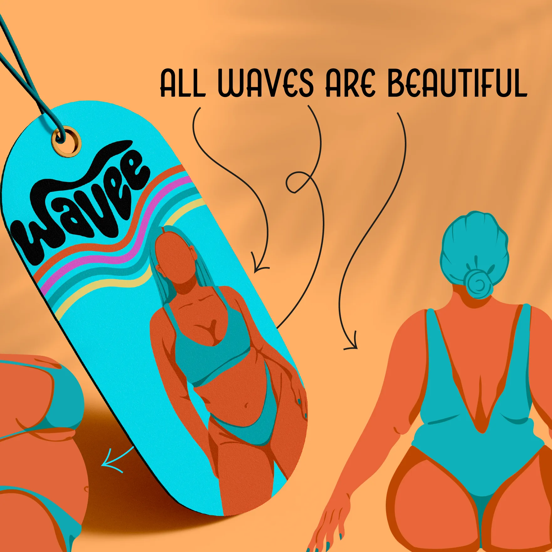
A body-positive, size-inclusive swimwear brand with a tropical, retro-surf aesthetic. Bold illustration, rainbow wave motifs, and vibrant colour bring confidence and joy.
Wavee Swimwear
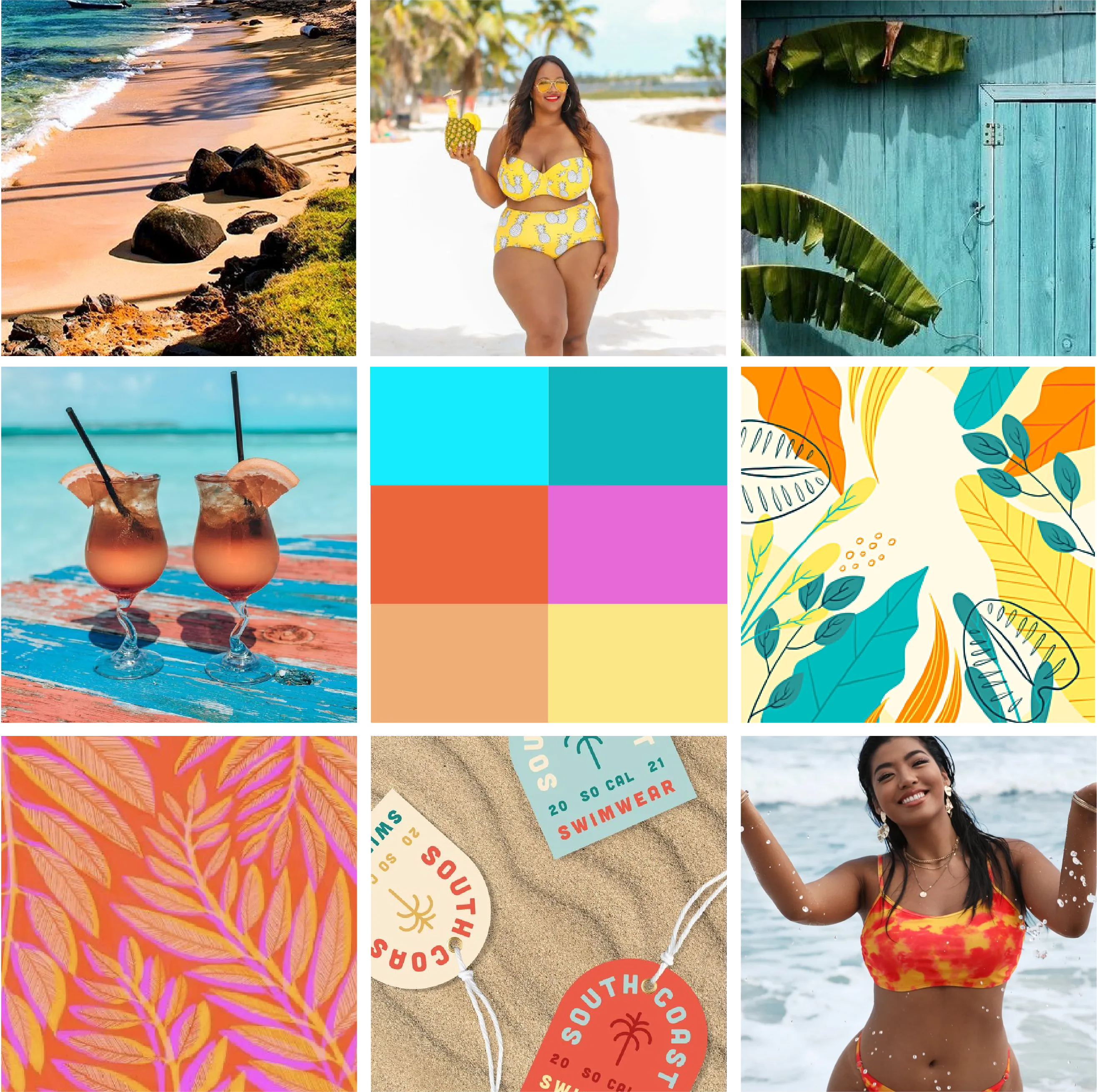
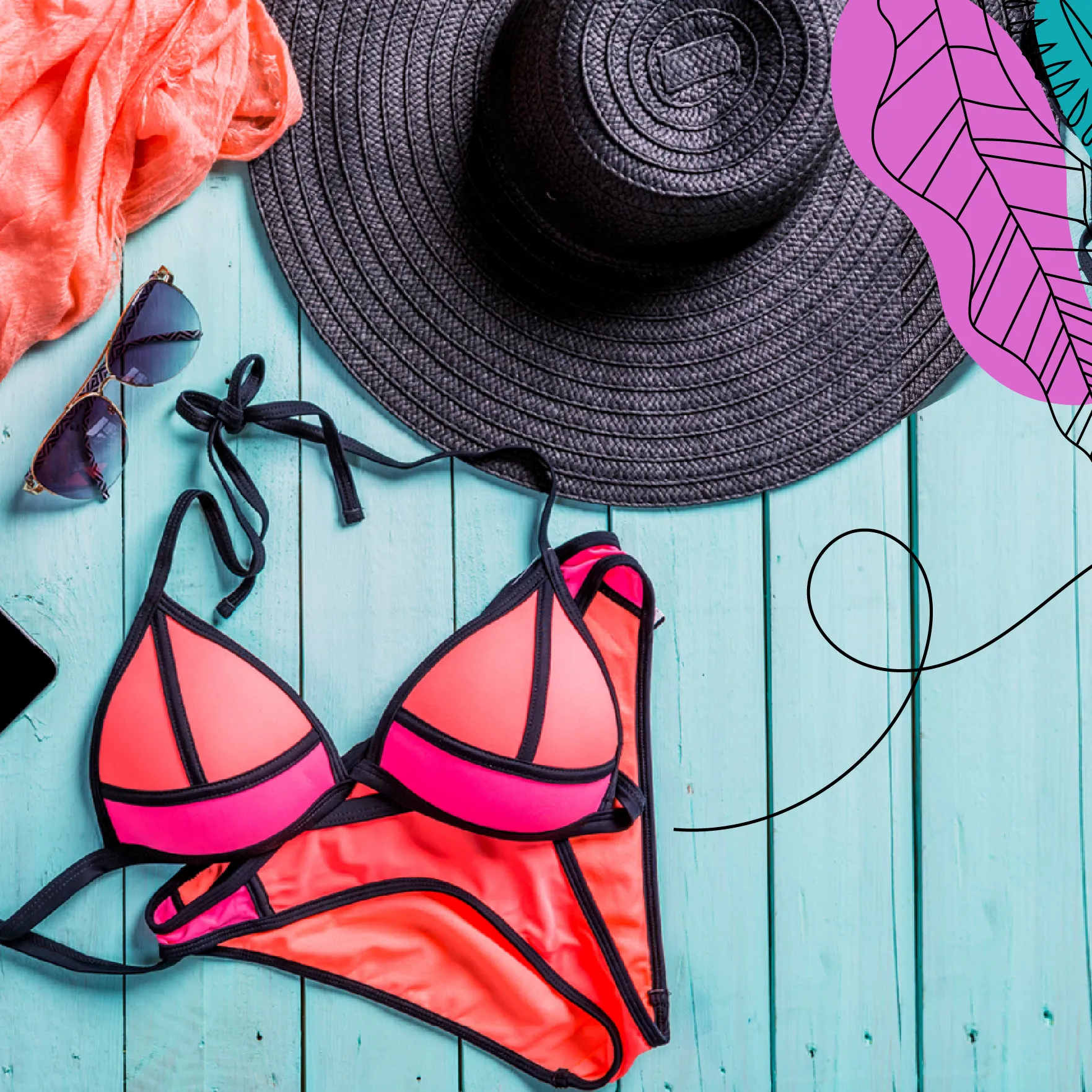
Electric cyan, burnt orange, hot pink, and golden yellow create a sun-soaked, tropical palette. The moodboard channels beach culture, body confidence, and retro-surf vibes with bold illustrative energy.
Wavee Swimwear
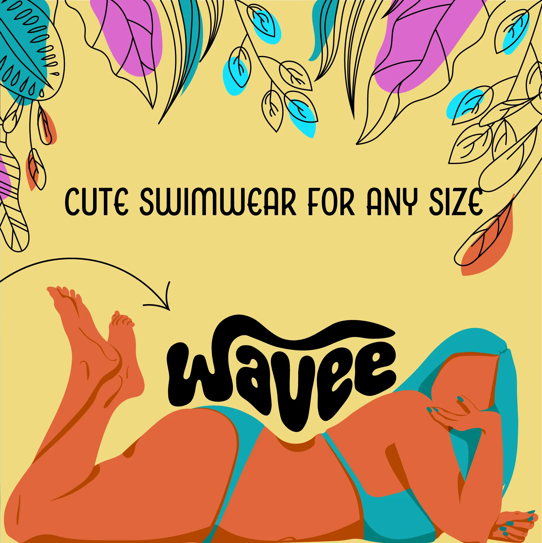
Presenting the retro brand design in an uplifting social media post that makes you want to go for a dive in your groovy new swimwear.
Wavee Swimwear
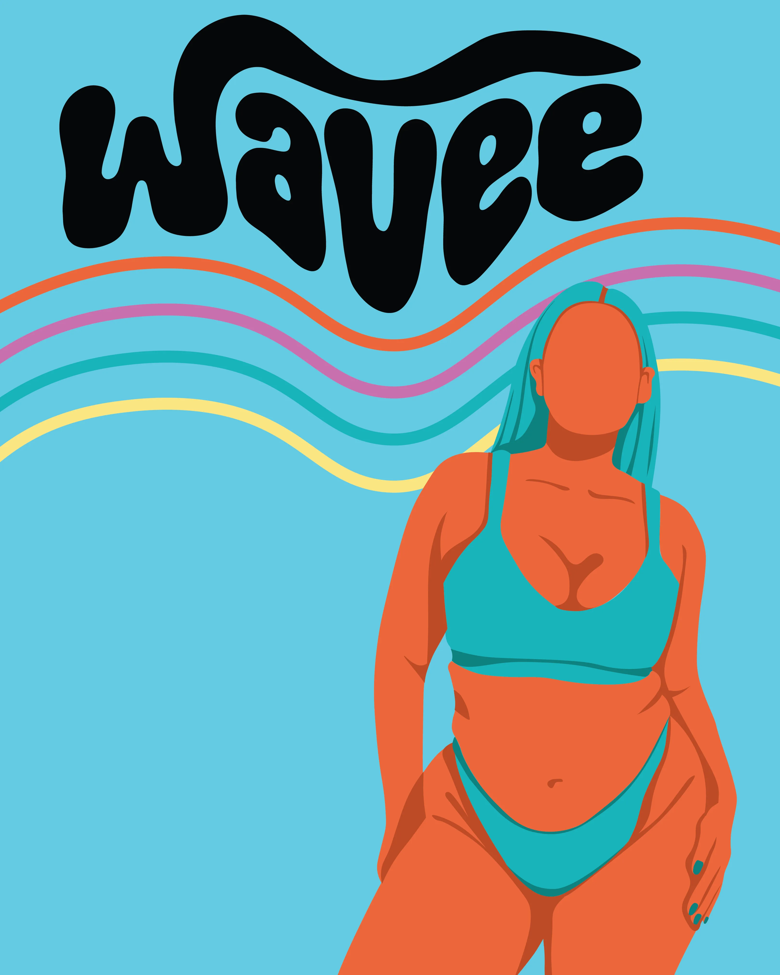
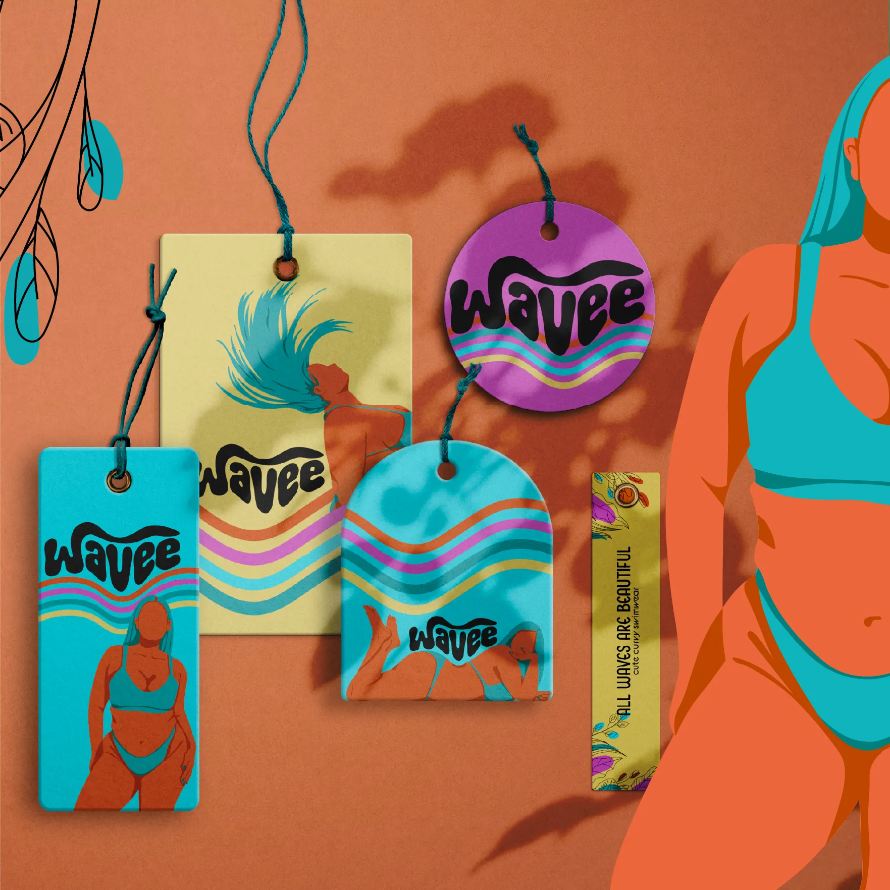
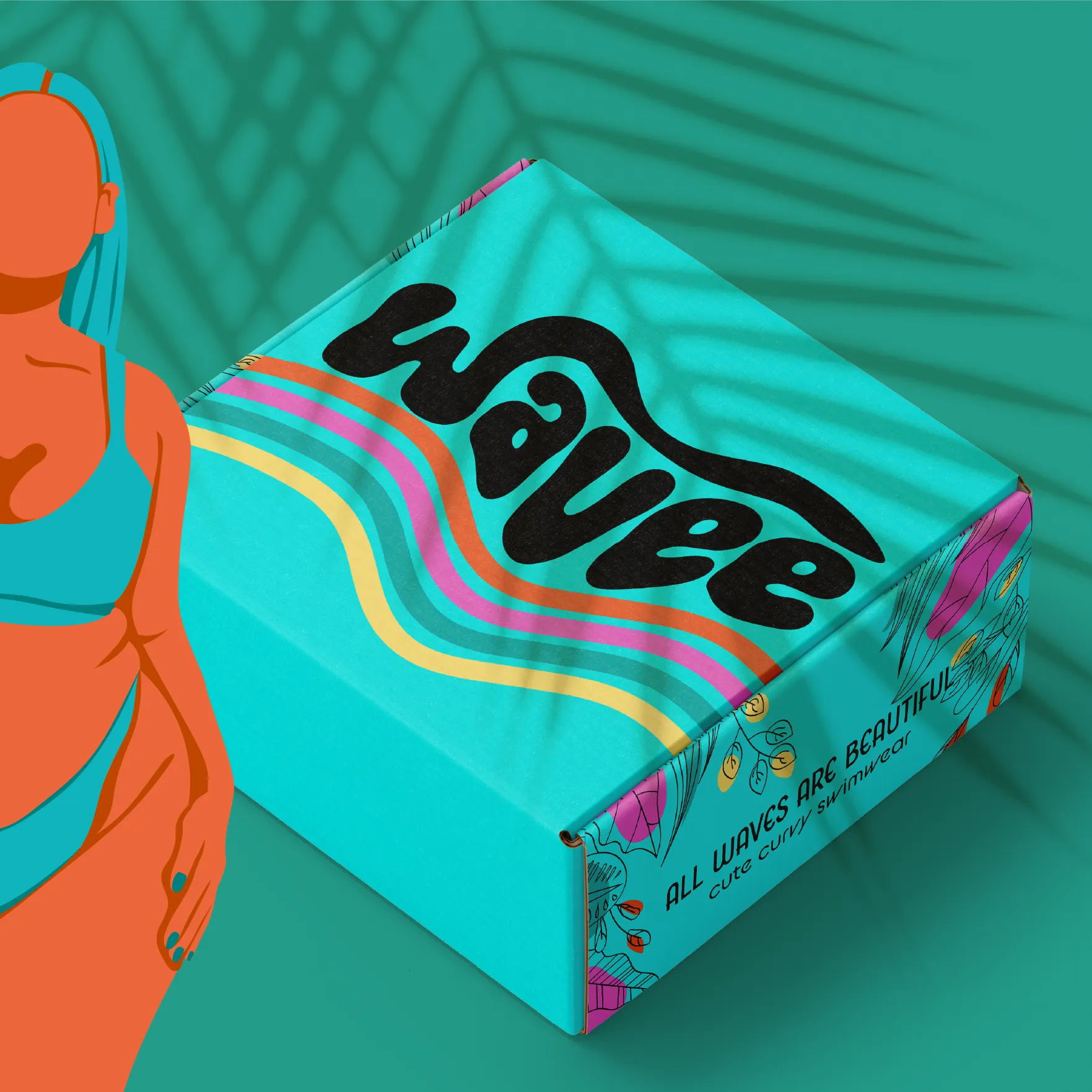
A hand-drawn, groovy wordmark with a distinctive rainbow wave motif running through every variant. Bold, organic letterforms capture the brand's free-spirited energy.
Case Study 03
An organic, serene aesthetic defined by a grounded, earth-toned palette. This identity was curated for an intimate, artisanal brand—balancing contemporary refinement with a timeless sensibility to evoke a sense of quiet authority.

Terra Ceramics
The moodboard explores the sophisticated fusion of contemporary minimalism and timeless heritage. Through a grounded, earth-toned palette, the visual direction establishes a sense of serenity, inviting the audience to disconnect and find repose.
Terra Ceramics
Translating a warm and inviting brand identity into high-engagement social content. By focusing on the brand’s core philosophy of intentionality, We crafted a visual narrative that encourages audiences to slow down and embrace the beauty of simplicity.
Advertisement
Every brand deserves a compelling digital presence that resonates with its ideal audience. We translate brand visions into bespoke, high-impact advertising designed to captivate the right clientele and drive meaningful engagement for new product launches.
Frauke Becker
Design that feels alive.